Product Photography: The Ultimate DIY Guide in 2022
Your product photography is by far one of the most important things for your ecommerce store. After all, visitors to your store can’t see, touch or smell your products in person, so it’s helps customers know what they’re getting. In this post, we’ll show you how to set up your very own DIY studio and shoot your own product photos. You’ll also learn some product photography tips on how to optimize your product images for ecommerce so that you can increase your online sales.
Part 1: How to Shoot Product Photos
Understand Your Camera’s Capabilities
There’s no denying that DSLRs are capable of taking better photos than smartphones. However, smartphone cameras are getting better and better, and the trick to great product photography is actually in the setup. You can take high quality, professional-looking product shots on a smartphone. That being said, it’s important to understand what your camera is capable of so that you can use it to its full potential.
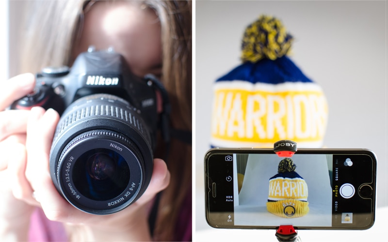
DSLR PRODUCT PHOTOGRAPHY
If you’ve invested in a DSLR, then you should definitely make the most of it and shoot manual. Start by getting familiar with the “exposure triangle”—aperture, shutter speed, and ISO. These three elements will determine how light or dark your image is, and the idea is to find the perfect combination for your setup and product.
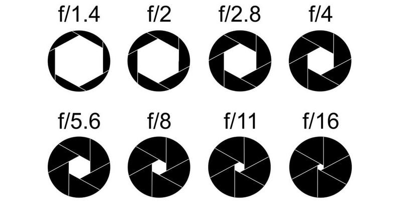
The aperture is the opening in the lens that determines how much light your camera will let in, and it’s measured in f-stops. It’s pretty straightforward—larger openings allow more light to pass through the lens and subsequently produce a brighter image. The confusing part is that the larger the f-stop number, the smaller the aperture.
(Source)
So, why can’t we just use the aperture to control the brightness of the photo? The aperture also determines the depth of field, or in other words how much of the product is in focus. A small aperture will capture everything in the frame, whereas a large aperture is likely to leave the back of the product blurry. If you look at the two photos below, they were taken with apertures of f-1.8 and f/10 respectively.
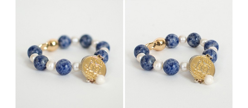
The trick is to find an aperture large enough to produce a well-lit photo, but small enough to capture the entire product clearly. Start with f/8 or f/10 and work your way up/down from there.
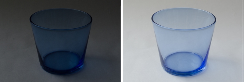
The shutter speed is the amount of time the opening in the lens is open for. Outside of product photography, shutter speed is altered in order to determine the way a moving object appears in the photo. However, for product photography purposes, it’s important to use a slow shutter speed to allow for a smaller aperture. Once you’re happy with your aperture setting (i.e. the entire product is in focus), you should adjust the shutter speed until you get the brightness level you need.
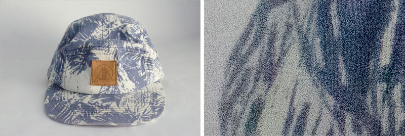
The last element of the trio is the ISO, which is your camera’s sensitivity to light. Increasing the ISO will allow you to take photos when the lighting conditions aren’t great, however, this does decrease the quality of the photo. You should never exceed 400 as you’ll start getting some camera noise. If you can’t take a well-lit photo under 400, your light sources aren’t bright enough. Aim to use natural lighting where possible.
SMARTPHONE PRODUCT PHOTOGRAPHY
If you’re using a smartphone, avoid using any pre-defined filters and frames and don’t touch the digital zoom, which actually just crops the photo as you shoot. All of this will decrease the quality of the photo, so save these kinds of adjustments for the image production stage.
Take advantage of the auto-focus and tap on the product prior to taking the photo. There are also a number of iOS and Android apps that allow you to control some of the manual settings (though the results won’t be the same as using a DSLR).
And regardless of whether you’re using a DSLR or a smartphone, never use the in-built flash. If you know what you’re doing, you can use an external flash. But generally speaking, if your product is too dark, this is a sign that you’re using insufficient lighting.
Also, given the popularity of filters, keep in mind that this can change the color of how the product is perceived, which can result in refunds if the product doesn’t match what the image looks like. So avoid altering the colors of your product photos, so customers are given a realistic picture of what they’ll be getting.
Steady Your Camera
Even if you have the steadiest hands IN THE WORLD, always use a tripod or a smartphone mount. This will ensure that you have track-sharp images, even if you’re working with a slow shutter speed.
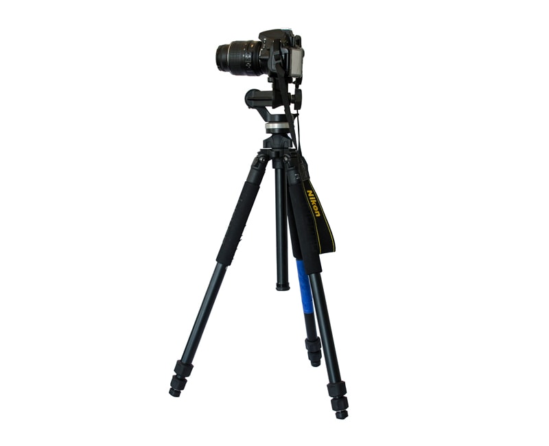
A fool-proof method of capturing clear and crisp photos is to use a tripod or mount and set a timer on your camera. When you press down on the shutter, or even lightly tap the capture button on your smartphone’s touchscreen, you apply downward/forward pressure to the camera—setting a timer will allow your camera/smartphone to re-stabilize. I like to use a 2-second timer because I find that it gives my camera just enough time to return to a steady position (and I’m too impatient to sit through the 10-second timer beeps).
Set Up a White Backdrop
When it comes to product photography, the key to a good setup is to shoot against a white backdrop. The white backdrop will reflect white light back onto your product and prevent any color spills. It’ll also ensure that your camera’s white balance calibration is on point, which will result in accurate colors.
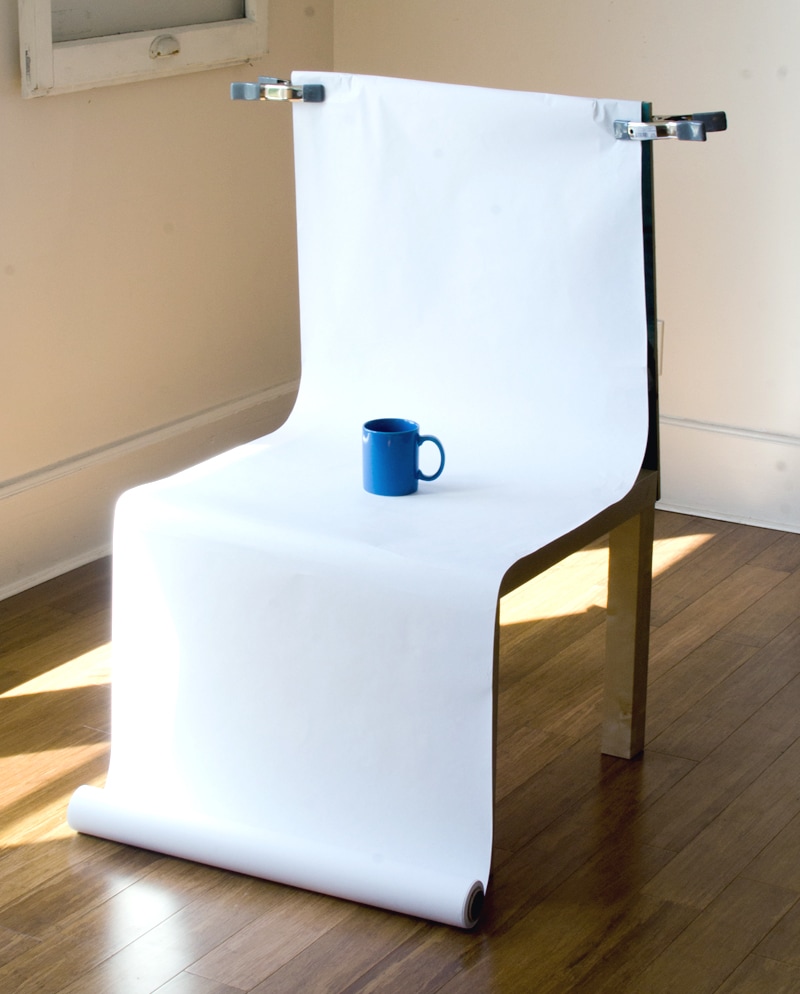
Using a sweep is definitely the way to go, which is just a backdrop that seamlessly transitions from the vertical to the horizontal surface. For smaller products, definitely opt for a shooting table and do tabletop photography; it’ll give you more flexibility with how you position the backdrop in relation to the light source because of how portable it is. Buy a shooting table online or make your own with an old table, some scrap wood, a hammer and nails, spring clamps, and the sweep itself. I like to use white wrapping paper as my sweep because it’s smooth and reflective, but you can use anything you have on hand.
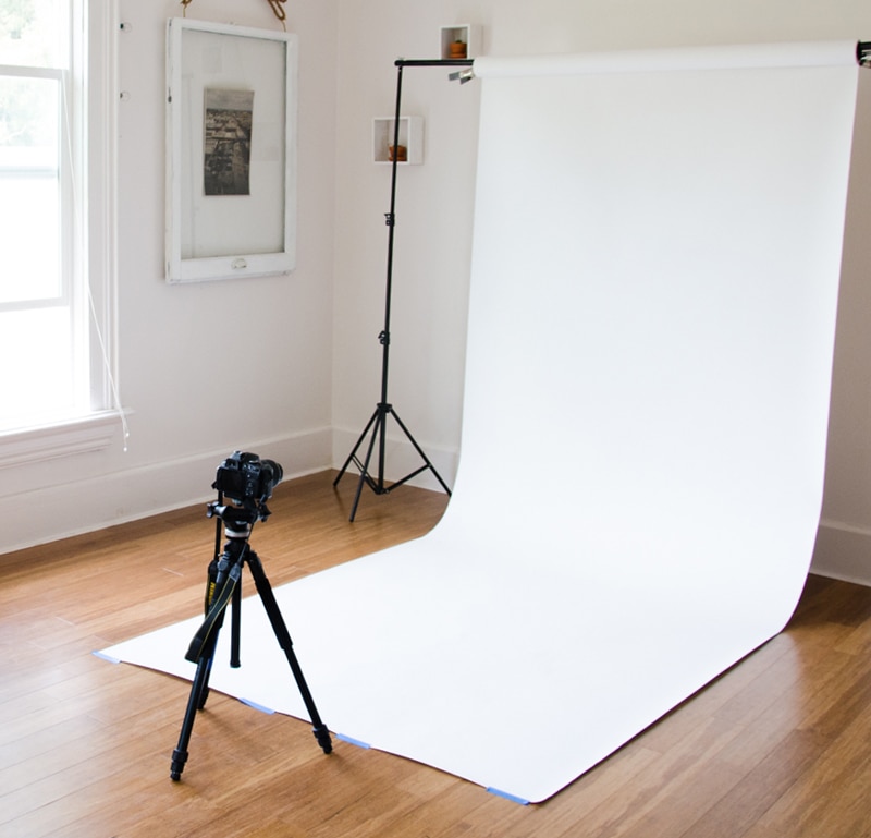
For larger products, it gets a little trickier. If you’re going to shoot frequently, buying a sweep with a stand will make your life a lot easier. If it’s a one-off shoot, grab an old sheet and find something to drape it over. I’ve used a DVD rack before!
Shoot Near a Window
Unless you know what you’re doing, avoid using artificial light sources. They require a lot of skill and expertise to use and it’s not worth the time or money if you’re just starting out.
Natural lighting is the way to go, just make sure you use it indirectly. Taking photos by a window and in a well-lit room tends to work best. In terms of positioning, the window should be to the left or right of the product, never behind or facing the camera. Natural light makes set up much easier as you don’t need to set up as much stuff.
When pairing natural light with a diffuser, you can create some beautiful product photography.
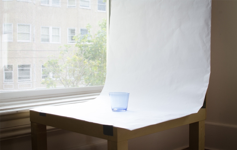
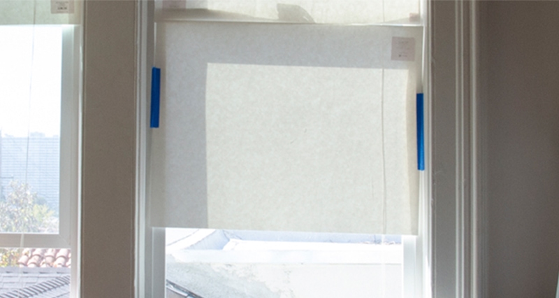
If you find that the lighting is too intense, you can diffuse it by covering the window with a white curtain/sheet or taping over it with white paper. You can also buy a diffuser for product photography online.
It’s also important to be prepared and get through the shoot as quickly as possible. The color and intensity of natural light changes throughout the day, so for consistent images, you need to be organized and work fast. Having an extra pair of hands will definitely help!
If natural light is your go to lighting source, aim to take all product photos at the same time every day, so your photos have a consistent look on your online store. However, you can edit your images in post production to help with a consistent branding.
Grab a Reflector
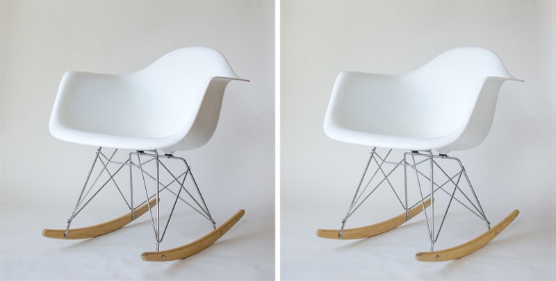
The only problem with shooting by a window is that the light will only hit the product on one side. To avoid harsh shadows and evenly distribute light across the product, you should use a fill light or a reflector. You can buy a reflector or create your own fill light with a white piece of card. Covering the card with aluminum foil will make it extra reflective.
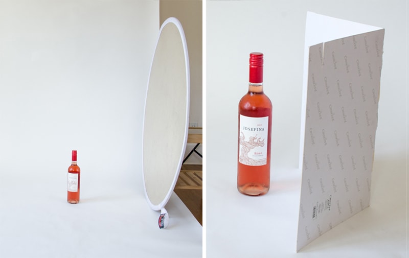
You should place the reflector on the other side of the product, opposite the window. You’ll just need to play around with the angle of it to find what works best for your product and setup.
Part 2: How to Optimize Your Product Photos for Ecommerce
Remove the Background
A white background will really make your images POP. It’ll draw attention to the product and give the image a clean, professional look. Furthermore, white doesn’t clash with any other color, so you can reuse this same shot regardless of the website theme or platform design.
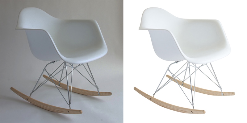
In post production, you’ll want to remove backgrounds for your images to maintain a consistent look on your professional product photography. The most accurate way of removing the background is to use the pen tool in Adobe Photoshop. It’s not the only way; there are a number of background removal tools online and you can try using the magic wand and quick selection tools in Photoshop too, but you’re unlikely to get a clean cut around the product.
To use the pen tool, select the pen tool and mark an anchor point on the edge of your product. The idea is to work your way around the product, creating what’s called a “clipping path” until you get to the first point and complete the path.

If you’re new to the pen tool, you’ll quickly realize that the tricky part is when the edge of the product isn’t straight. If you click and hold, you’ll see these two funny lines with dots at the end appear; these are called “bezier handles” and can be used to manipulate the curve of the line. You’ll have to play around with the pen tool yourself to get the hang of how they work.
Once you’ve completed the path, click “Selection” at the top and hit enter. You’ll see that the product has been selected.

Swap to the selection tool, right-click the selected area and click “Layer via Cut,” which will separate the background and product onto two separate layers. Delete the background layer and you’ll have the product on a transparent background (represented by grey and white checkers). If you’d like a white background, simply add a new layer and fill it in with white.

Although the results are amazing, unfortunately, background removal does take time and it is quite a fiddly process, particularly when it comes to more intricate and detailed products such as jewelry. It’s a good idea to outsourcing the editing so that you (or your graphic designer) can spend time on more growth-related tasks.
For those looking for budget ways to remove backgrounds, you can find Shopify Apps like Pixc which will remove backgrounds. However, if you’re looking to do it yourself affordably, you can find a background removal tool on Canva’s Pro Plan. All it takes is a quick one click button. The technology has come a long way, making it possible without Photoshop.
Keep the Editing Simple
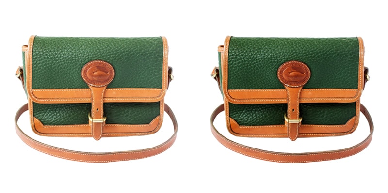
There’s nothing more annoying than receiving your online purchases and discovering that they’re nothing like what you imagined. You’d probably return the item and never shop on that store again. Your product photography and post production editing needs to mirror what the product actually looks like.
Adjust the color balance of the photo to ensure that the colors in the photo match those in real life, and only tweak the brightness and contrast (or the levels if you’re Photoshop savvy) to give it a more professional product photography look.
Note: Learn more great ways to edit your product photography for your ecommerce store with our Step-by-Step Photoshop Tutorials for Ecommerce article and create perfect product pages with our guide to Product Page Design!
Apply a Template
Creating a product image template is an easy and efficient way to make your product images look consistent. Start by choosing a size you’ll use across your ecommerce store—anywhere between 1200px and 1600px on the longest side is ideal because it’s large enough for an effective zoom function and to use across social media.
Note that the size you choose will be applied to all your product images, so you should think about the shape of your product when you’re choosing your dimensions. If your products are longer vertically, a portrait template might be better. Similarly, if you have really wide products, a landscape template will help you reduce the unnecessary amount of space at the top and bottom.
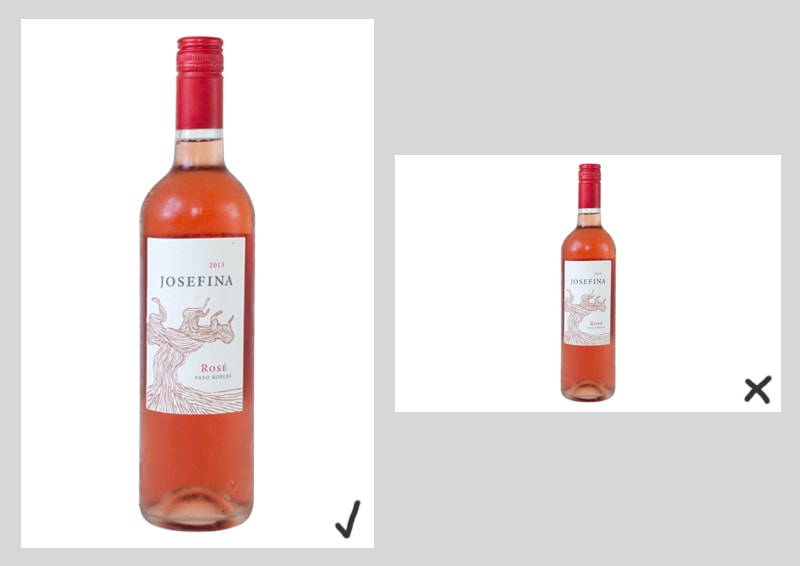
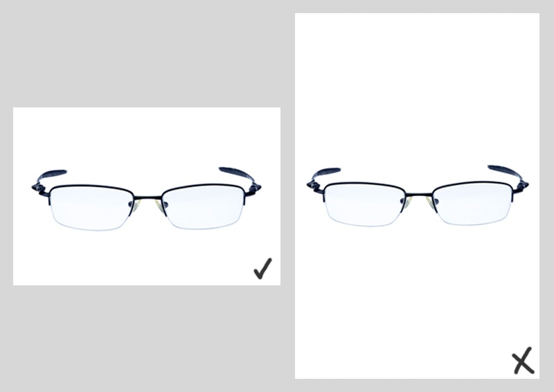
Note: If your products are all different shapes and sizes, stick to a square template.
The easiest way to create a template is to create a blank file in Adobe Photoshop and to resize it to the dimensions you want. Use guides to identify the center-point by creating a vertical and horizontal line at 50%, which will help you position your products later.

Your products should take up around 90% of the canvas, so it’s also good to create equal guidelines around the edges. When you drag each individual product into the canvas, resize it until either the top and bottom or left and right sides of the product touch the guides.
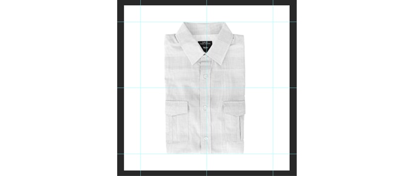
Doing so will allow you to align your products, which is a lot more noticeable when they’re all next to each other on a white background. If you look at the two rows of product images below, it’s easy to see that the first row has been created without a template; the shirts are all different sizes within their own canvases. This is likely to happen when you resize your products by eye. On the other hand, it’s clear that the products in the bottom row were resized using a template, as the top and bottom of each shirt is aligned.


Reduce the File Size
As can be expected, large images take longer to load. When I say large, I’m referring to file size rather than the dimensions of an image, i.e. the value in KB, MB, GB, etc. Seeing as 47% of users expect a webpage to load in under 2 seconds, and 40% will abandon a page that takes more than 3 seconds to load, it’s important that your images are small enough to ensure a speedy site.
It’s possible to reduce the file size without significantly reducing the quality of your images. My favorite method of reducing file size without significantly reducing the quality of the image is to use Photoshop’s “Save for Web” function. Open your image in Photoshop and go to File > Export > Save for Web (Legacy)… A window will appear which will allow you to choose your export quality. I find that a quality of 60 works best because it drops the file size down to below a megabyte and there’s no noticeable difference in quality.
Note: ImageOptim (Free) is a great little app that will further compress your images just by dragging and dropping them on the ImageOptim application icon. It will re-save the file and can save you another 20-40% in file size on average.
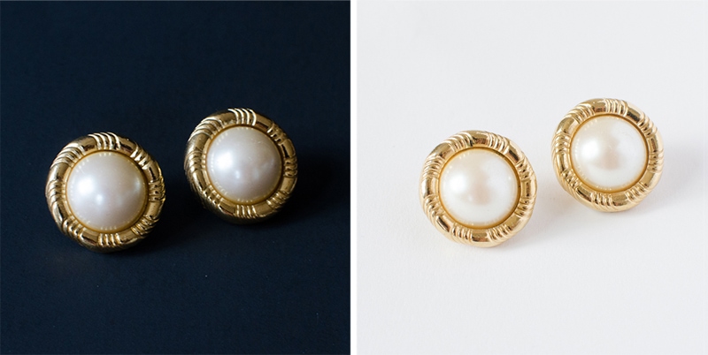
If you take a look at the photos below, the left shot of the earrings was saved as a regular JPEG image, with the quality level set to 12 or “Maximum.” The shot on the right is an exported web JPEG, where the quality level was set to 60 or “High.” The difference between the two is barely noticeable; the right is simply a little less saturated in terms of color. Learn more about optimizing images for the web in this step-by-step article (that also includes a video walkthrough!).

A Few More Product Photography Tips
1. Take A lot of Product Photos
Product photography requires multiple angles and photos to help people clearly see the product they want to order. Taking photos of a product’s sheerness in clothing will help reduce unnecessary refunds. Every product has it’s quirks. It’s important to capture the many sides of a product, so customers aren’t surprised when it finally arrives. Taking multiple product photos will also help you find the best photo to use to best represent the product. Plus, if you aren’t hosting video on the product page, you’ll want product photos of the sides and back.
2. Take Lifestyle Shots
Depending on the product, lifestyle photos might be a great addition for your collection. It could work well for fashion, beauty, or even outdoors products. When it isn’t clear what exactly a product is, a lifestyle shot can help people see an item being used to better understand its purpose. Alternatively, lifestyle shots can be used on social media to promote the product on your website. So while you don’t need to use lifestyle shots for your online store, you might use it to promote the product visually in other marketing channels.
3. Group Other Products
While this doesn’t work for all product photos, in some niches like fashion, combining other products in a single photo can help with a buying decision. Taking photos of a two-piece outfit, with footwear, and jewelry can help you sell more products on your online store. It can also create a better visual appearance seeing an entire look put together, so that people want to add all those items to their cart. Plus, great photos aren’t always about a singular product. Sometimes, mixing and matching other products together can create high quality images that push sales, which is what you want your product photos to do anyway.
4. Avoid Mixing Lighting Types
If you’re using artificial product photography lighting, you won’t want any sunlight in the photo. Mixing lighting types can create an unappealing product photo. So choose: natural or artificial light. If you use artificial light, take your photos in a dark room. If you use sunlight, turn off artificial lighting. It’ll just make photo editing that much easier.
5. Show Scale
One of the challenges of shopping online is that you can’t see an item in person. Ultimately, showing an item’s scale can be a great way to accurately represent your product. You don’t need a fancy product photography setup to do this. Even having a ruler or common object in the photo to show the item’s size can help people understand how big or small the item truly is. Don’t do photo editing that tricks people into thinking something is bigger or smaller than it is. It’ll only result in refunds. Be as transparent as possible for your product photography.
Product Photography Conclusion
So what are you waiting for? Grab your camera, set up your studio, and snap away! Although optimizing your product photos for ecommerce may seem like a lot of extra work, the results are worth it!
Take the time to get them right, because amazing photos will make your ecommerce store look a lot more professional and you’ll also be able to use them across social media to drive traffic to your store. Plus, once you get into a routine, you’ll be pumping out retail-ready product images in no time. Once you master the art of taking great product photography, take the next step and write great product descriptions, too!


