How to Create a Unique and Memorable Logo: The Beginner’s Guide
A well-designed logo can help tell customers who you are as a business, all the while making you stand out from the competition.
Your logo is to your business what your face is to you. It is a graphic representation of your organization and often the first point of visual communication you will have with your intended target market. Just like you wouldn’t enter a business meeting with a disheveled, unpleasant face, you don’t want the first impression of your business to be based on a poorly designed, unattractive, or outdated image that will reflect negatively on your organization and product offering.
This guide will help you take steps in the right direction when creating a logo that best suits your online business. From initial research to design elements, choosing what tools to create your image and how to evaluate your competition, we will walk you through every avenue needed to create imagery that will help you best attract consumers to your brand.
Research
What is your business? Who are the people in your target market? How do your prospective clients and employees perceive you?
The answers to these questions are all elements that need to be included in the design of your company’s branding. Ultimately, the goal of your logo is to say exactly what your company is about—your mission, values, the quality of your products, etc.—without saying a word. It is important, then, to know exactly what you want to say, and to who, before beginning the actual design process.
The answers to the aforementioned questions will help when choosing design elements, which will be touched upon in the next section. As every visual element has a cognitive association, it is good to map out what you want to portray before diving into a design that has no real psychological usage behind it.
Let’s consider the following example:
John runs a very serious, sales-based tech startup. As they have a B2B business model, John’s company culture encourages a very aggressive, sometimes off-putting approach to closing deals, however, his company logo consists of a bright blue sky and yellow sun with a cloud as the centerpiece, signifying his integration of cloud-based technologies. The tone of John’s logo gives an impression that interactions with his business will be happy in nature due to the use of bright, happy colors and nature-based imagery. This is not aligned with the actual experience that John’s business offers, creating false expectations that will result in unhappy customers. As such, John’s branding does not do the job of explaining what his business does and the experience they provide.
Although a very simplified example, we see the importance of research in the company logo design process. Without knowing what you want to portray as a business you cannot correctly identify the elements that will best reflect your organization’s values within your branding.
How to Create a Unique & Memorable Logo
Everything you put into your logo design will say something about your business, your product, or the interactions your consumers will have with you. Details like color, font, and shape all have an impact on the psychological impression you leave with your current and future clientele.
Color
Monochromatic
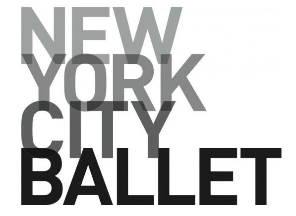
A monochromatic theme implies elegance and sophistication.
Regardless of your goals for your logo, you are going to need a black and white version of your logo for press purposes. There will be instances where a color logo may not fit in with the context of certain marketing collateral, especially when being featured in marketing or publications from external organizations, so make sure you have a monochromatic version of your branding handy.
For those looking to have their default logo in these hues, images with a monochromatic palate typically imply power, sophistication, cleanliness, and simplicity, especially when paired with a more elegant typeface. There are cultural implications, however. In Western societies, black is symbolic of death and mourning, while white has the same implication in many Asian cultures.
Cool Tones
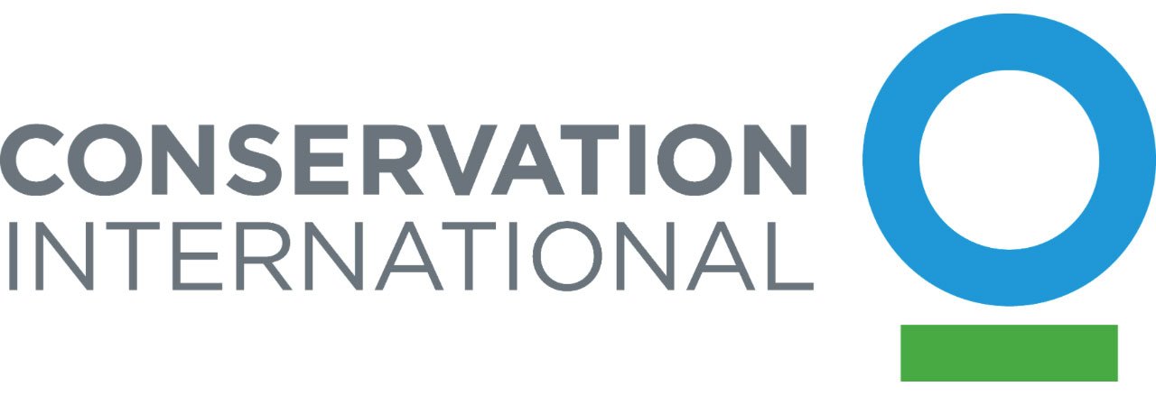
Cool blue and green tones are used to complement the text in driving home this organization’s basis in nature.
Blue, as the world’s most favorite color, is the most commonly used hue in corporate logos as it evokes feelings of professionalism and success. Similarly, green tones, which are extremely common in financial services marketing, have a psychological association with wealth and luxury, as does the color purple. Greens and blues are often also used in combination with one another to show association with nature and conservation.
Warm Tones
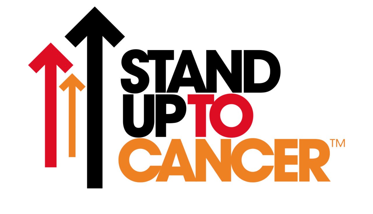
The warm tones create an eye-catching contrast to the black elements within this logo.
The use of reds, oranges, and yellows are common within food marketing as studies have shown that their presence often stimulates appetite and hunger. Their bold appearance incites energy within the brain, often used by brands trying to conjure excitement and fun. Evident in their widespread use in road signage, their ability to draw awareness to the human eye also makes these hues a great attention grabber.
Font
Serif Fonts
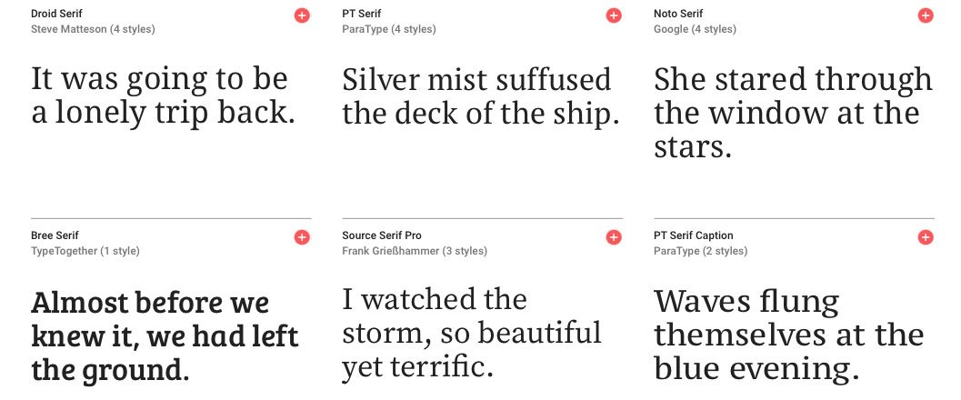
Serif fonts are best suited for companies looking to associate themselves with tradition and propriety. They’re also a great choice for brands looking to give off a timeless feel. They typically receive the best response from older generations, so those looking to target a younger crowd are probably best in choosing a different style for their branding efforts.
Sans Serif Fonts
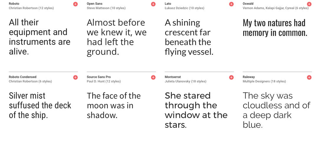
Sans serif fonts are very versatile, often meshing well with most shapes and designs that may be included in your branding. They are easy to read and neutral by design. If you are looking for a futuristic, modern, and straightforward look, choosing a sans serif font may be the right way to go for your logo.
Modern Fonts
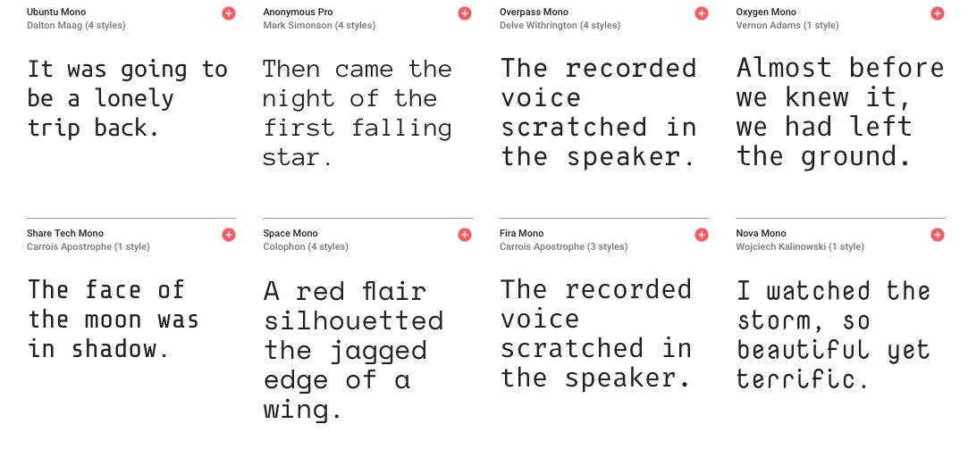
Effective with younger, more hip demographics, these typefaces typically give off a sense of sophistication and complexity, and an overall feeling of power.
Handwritten Fonts
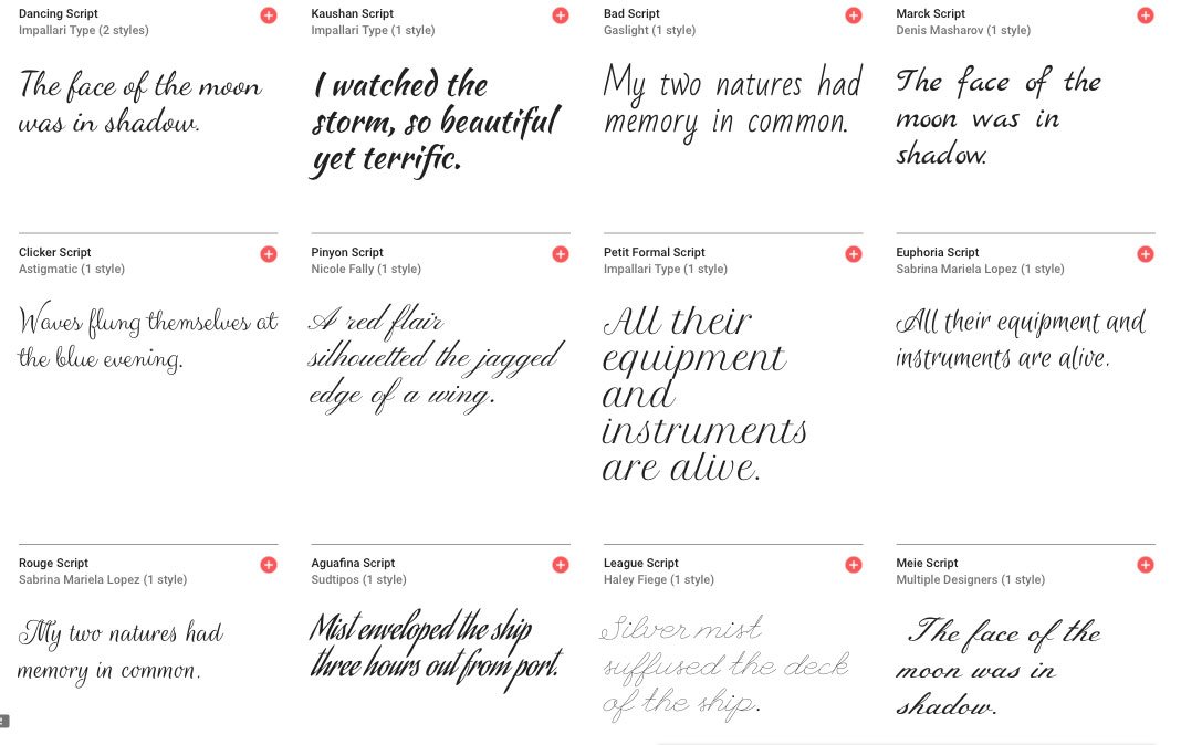
Handwritten fonts are typically used by brands wanting to give off a formal, elegant, and/or feminine vibe to their target market. While displaying these characteristics effectively, the use of handwritten fonts should be exercised with extreme caution. By design, the nature of these fonts could cause readability issues when being resized, which is common when being placed amongst different marketing collateral. They also can cause strain on the eye, so any copy using handwritten typeface should be kept short.
Other Fonts
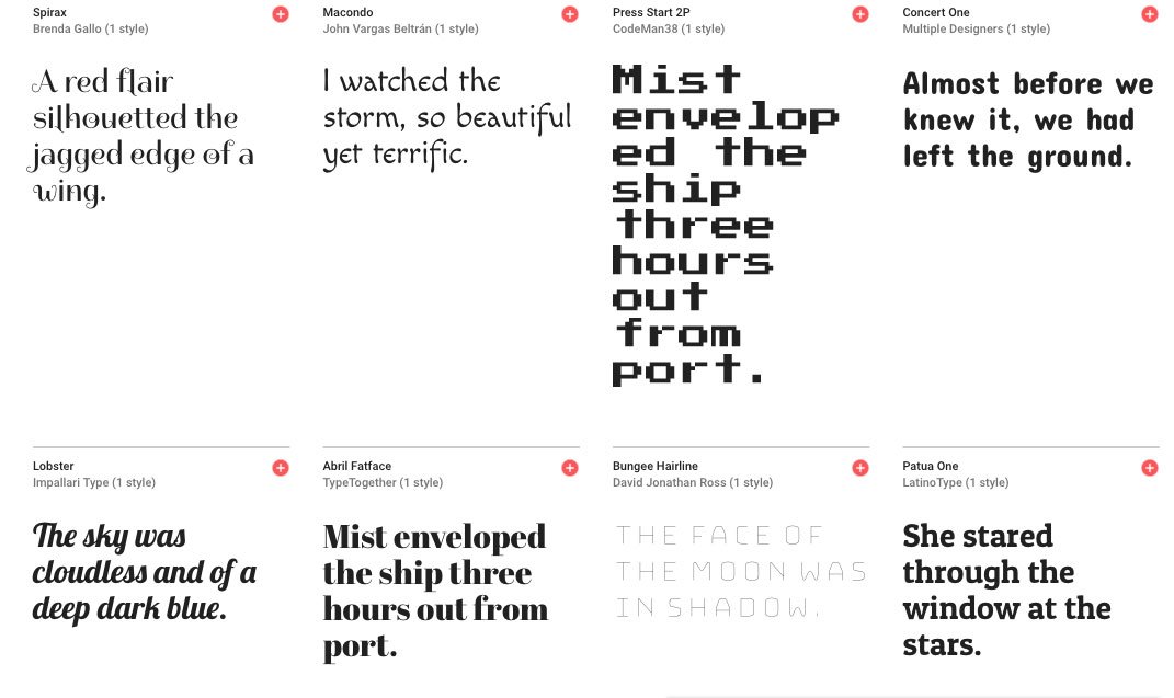
There are many fonts that do not fit into the aforementioned categories that are quite common within the realm of logo design. Many businesses opt to create their own custom typeface to avoid replication by other organizations, which is an option when choosing a design professional to create images. Typically, these fonts do not portray simplicity or elegance, but can be quite effective in reaching your target market, should the proper research be done in regards to what your potential consumers will react best to.
Shapes
Circles
AT&T’s 2016 rebrand included the sole use of a circle icon in their branding.
Shapes with a lack of points, specifically circles, often give off a gentle association within the human mind. They are often associated with femininity, security, protection, community, love, and support. Circles historically are also known for having a time value, often representing infinity and continuity.
Squares & Rectangles
Kodak’s bold use of color makes up for the nonabrasive square shape to attract attention.
One of the most popular shapes in corporate logo design, squares trigger feelings of stability, balance, and reliability in the human mind. As a common shape in branding, they have taken on a secondary neurological response associated with strength, efficiency, and professionalism. Their popularity might prompt many to continue using this shape, however, their nonabrasive appearance in association with constant human exposure have caused squares to be more overlooked by the human eye. Anyone wanting a logo that really stands out should consider this.
Triangles
Lavado’s logo utilizes numerous triangles in their design.
The three-pointed shape is often viewed as a more masculine shape, as it is associated with strength, conflict, and speed. Triangles often represent direction and movement and are commonly used to replace the letters “A” and “V” in wording.
This shape is also unique in that certain psychological inferences are dependant on their orientation. A triangle sitting on its base represents tension and change while being placed on a point often signifies instability.
Ways to Create a Logo
In the highly technical world we live in there are numerous options for actually creating your logo that was unimaginable just years ago. When deciding which avenue to venture down take into consideration the time and money you are willing to invest in a design, as well as the quality of the image you want to display on your marketing collateral.
Typically, a high-quality, custom-designed logo would need to be done through a graphic designer. However, commissioning a professional to do your branding could set you back hundreds of dollars and the actual process could take weeks should edits need to be made.
On the opposite end of the spectrum, there are numerous online logo makers that can create simple, inexpensive images in a short period of time. Typically, these web-based options allow for a quick turn around from initial design to completion, however, the quality of the logo created is low and in many instances the design elements are not unique, allowing for others to have logos that could possibly replicate yours. Additionally, many of these tools require the user to have a decent amount of design knowledge, which may be a deal-breaker for those who are less aesthetically inclined.
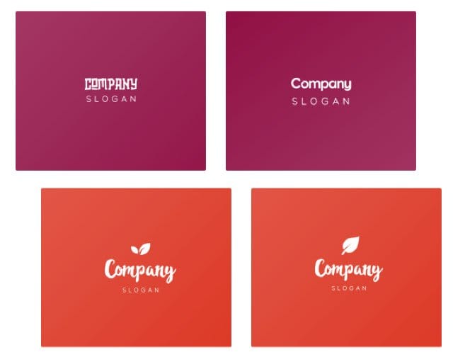
Design variations using an online artificial intelligence logo maker
Most recently, a new wave of online design tools has been created to help overcome the shortcomings of both these methodologies. Artificial intelligence powered logo designers use machine learning to help create designer-quality logos for a fraction of the cost of a designer and in a matter of minutes. By completing a few initial questions focused around design preferences, machine learning algorithms generate numerous design variations from which to choose from. With a seemingly unlimited number of designs generated, there is sure to be an image that fits the needs of your business. This may not be a good option for businesses who want their own custom fonts or complicated design features but for those looking to keep their branding relatively simple, which is always best when it comes to logo design, this is a great middle point between hiring a graphic designer and using a standard online creation tool.
Competition
Your research is completed and some preliminary designs are created but before you can decide which one to go with, you must place it in your competitive landscape and see how you stack up, much like you would with any other marketing initiative.
Put your competitors’ logos side-by-side. If you’re in a heavily saturated market look at the market leaders within your industry, as well as those with the least market share. What are some commonalities between the more successful companies? What do they do that differs from those who are not as successful? Be sure to figure out what is working and what isn’t within your industry to ensure your branding is at the same quality level as the big guns in your field.
Next, put your logo side-by-side with the competition. Does your imagery hold up to the quality of work of your competitors? You don’t want to put off potential clientele by having branding that is sub-par to others in the industry. In fact, ensure that your image stands out from the pack; a more visually appealing brand could be the differentiator for customers viewing competitors with similar product offerings.
Conclusion
Logo design is a science, and not one to be taken lightly. As the first form of communication between your business and your future clientele, your logo speaks volumes to the industry you are in, the work you provide, and the kind of value you bring to your consumer. You can only make a first impression once, so it is important to make it count. As the saying goes, “a picture is worth a thousand words,” so make sure all thousand of those words being spoken are true to your organization and help you attract the business you want to help grow your company.


