How to Create a Picture Perfect Product Page for Your Ecommerce Business
Your product page design is one of the most important and complex pages of your store. Consider all of the situations where a potential customer might land on your product page:
- Directly from a search engine
- After browsing through your store
- After clicking through a targeted advertisement
As one of the final steps in a sale, your product page has to be:
- Optimized to ensure it can be found easily,
- Informative enough to instill confidence in your customer, and
- Designed well to provide a great online shopping experience
There is a range of things you can do to improve the chances of people finding your product page and increase the rate of conversion once they get there. To break things down, we’ve created a five-part guide to creating the perfect product page.
Part 1: Understand the Components of Great Product Page Design
Before diving into the details of how to optimize each aspect of your product page, let’s look at a great product page design example to understand how each of the components fit in and why they are important.
Uniqlo Australia has an excellent example of a product page that is designed with the user in mind. Here is a screenshot of one of their typical product pages with the key components highlighted:
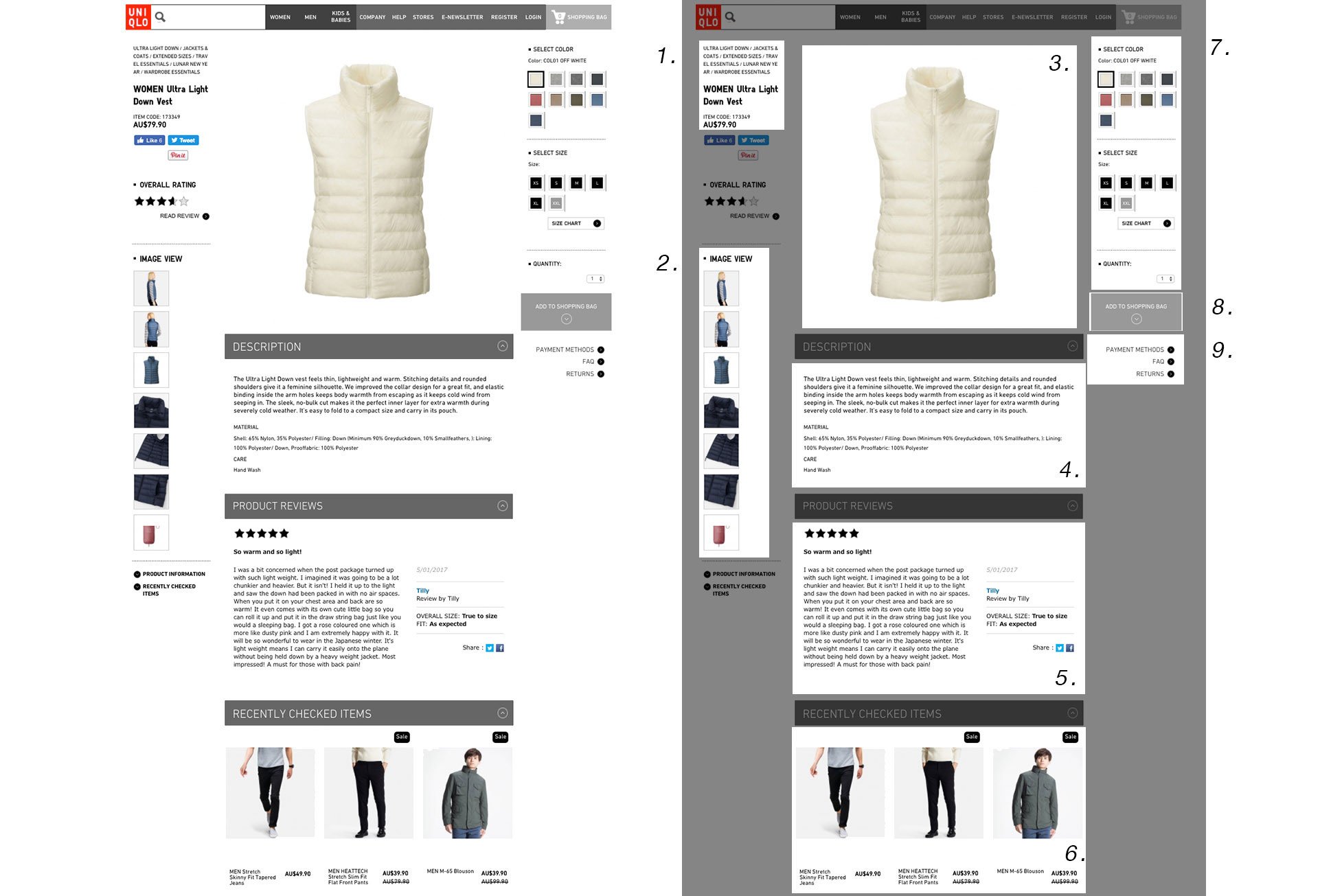
Immediately, you will notice that >90% of the page is dedicated to providing more information to the customer about the product they are viewing and almost no space is wasted above the fold. To break down each section even further:
- The product title and overview are easy to locate. In the same way buildings and signs act as points of reference when you’re visiting a new city, good titles help customers navigate a new site.
- A gallery of images showcasing the product from various angles, with a model, and up close.
- The product image is front and center. A clear photo on a white background showcases the product in the best light. Images are what the customer looks for so it pays to make them prominent.
- A unique, detailed description of the product that describes what it is, the thought behind its design and how it solves the buyer’s problem.
- Sincere customer reviews that help build confidence in your product and brand.
- Customers know what they want, but they might not know how to find it. Showing recently viewed or related products helps them narrow down their options faster and gives you an opportunity to showcase products you think they might prefer.
- Plenty of options and variants on the one page means a customer does not have to navigate through multiple products.
- Right after the customer finishes selecting their options, the “Add to Cart” button is waiting for them.
- Not ready to commit? Links to extra information such as your shipping and returns policy help answer any lingering questions.
I always find it helpful to look at how other stores have designed their product pages. You don’t necessarily have to look at stores within the same industry either. Consider looking at what strategies popular websites in other industries are doing that customers love but aren’t being utilized by your competitors.
On most successful product pages, you will find a variation of these same components:
- Clear and unique descriptions
- Great product photography
- Reviews to instill buyer confidence
- Customization options
- Clear “Add to Cart” button
- Additional shipping or purchase information
Part 2: Answer these Questions in Your Product Copy
Great copy is crucial for your product page. Not just for your customers, but also for SEO. Using manufacturer or generic product information is a surefire way of making sure your product isn’t competitive in search rankings.
To create great product page copy, there are a few questions you can answer.
What is It?
The first thing your product copy needs to address is what exactly the product is. If the customer is looking for a specific product, this is the first thing that they want to be answered.
For new products, they want to know what exactly it is and why they should be interested.
How Does it Solve the Problem?
What problem does your product solve and how does it solve it? This is the fundamental question that you need to answer for your customers.
Perhaps it is as simple as a utility function like a sweater that keeps you warm. In that case, include what materials or manufacturing processes have helped make your product’s solution possible.
Or maybe the problem is a little further down the hierarchy of needs, and the product just helps you look more stylish. What story or process behind the product makes it desirable to own?
Whatever it is, by identifying the problem your product solves, you can understand the questions your customer would ask themselves when purchasing and tailor your copy to answer them.
Why Your Product?
You’ve established that there is a problem and how your product can solve it. Now, why should they choose your product over a competing one? What extra steps have you taken to ensure your sweater is the warmest? What ingredients do you use that no one else uses? Here is your opportunity to showcase why your product is special.
Even if you’re selling goods from another manufacturer, taking the time to show that you understand the reason why this product is better, shows that you have taken the time to do your research.
What is it Made Of?
The final detail to add is what might be considered metadata for your product. Providing information on the materials or ingredients that go into your products helps compensate for the inability of online shoppers to feel the products for themselves.
Simple information such as the ingredients, and basic instructions such as how to care for it or its intended use, can help the customer visualize the product and provide greater context to search engines.
Part 3: Create Great Product Images
Your product photos are often what the customer sees first on the page, and they can instantly shed your product in a negative or positive light. But aside from first impressions, product photos also help convey a far greater amount of detail than possible with text alone, which can help to sell the product. Product photography done well can even decrease the number of resources spent on customer service and returns.
So here’s what you need to do to create great product images:
Start with Good Photography
Poorly lit photos taken without decent equipment can be a red flag for customers. Not taking the time to shoot decent photos can actually cost you more time when it comes to editing.
But… you don’t need to spend a lot of money to get a great a small photography setup. The A Better Lemonade Stand Guide to DIY Product Photography lists how you can get started with DIY product photography on any budget.
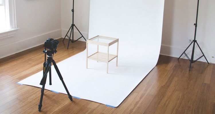
Your basic requirements for a DIY Product Photography setup should include:
- A Good Quality Camera or Smartphone: You don’t necessarily need a DSLR camera for product photography. Your smartphone will produce photos that have a high enough resolution and an adequate number of settings to adjust light and aperture conditions.
- A Source of Consistent Light: Your lighting should help illuminate the most important features of your product and hide any shadows. Natural light is ideal for getting started as it is not as expensive or finicky as artificial lighting; however, you’ll also need to use a fill light or mirror to evenly distribute the light source from both sides.
- A White Backdrop: White backdrops help deflect the light evenly so less work is needed to fix contrast. It also makes editing the photo later using the Magic Wand or pen tool much easier. You can use a roll of paper or even a sufficiently white sheet to get started.
- A Steady Surface: To take your photos on, evenly.
- Clips: To hold your backdrop or lighting in place.
- A Tripod: To hold your camera. Having a tripod isn’t a necessity, but it will help you take consistent photos quickly for many different products. If you’re a one-man photography operation, it can make things easier as well and save you time in post-production.
Use Multiple Images
It’s not enough to just use a single product shot. Customers want to see the product from a variety of angles and perspectives. Your product photography can showcase the most important aspects of your product far better than any description, so it’s important you add as many photos as necessary to answer the customer’s questions.
Different photos can also have various levels of importance at different stages of the buying process.
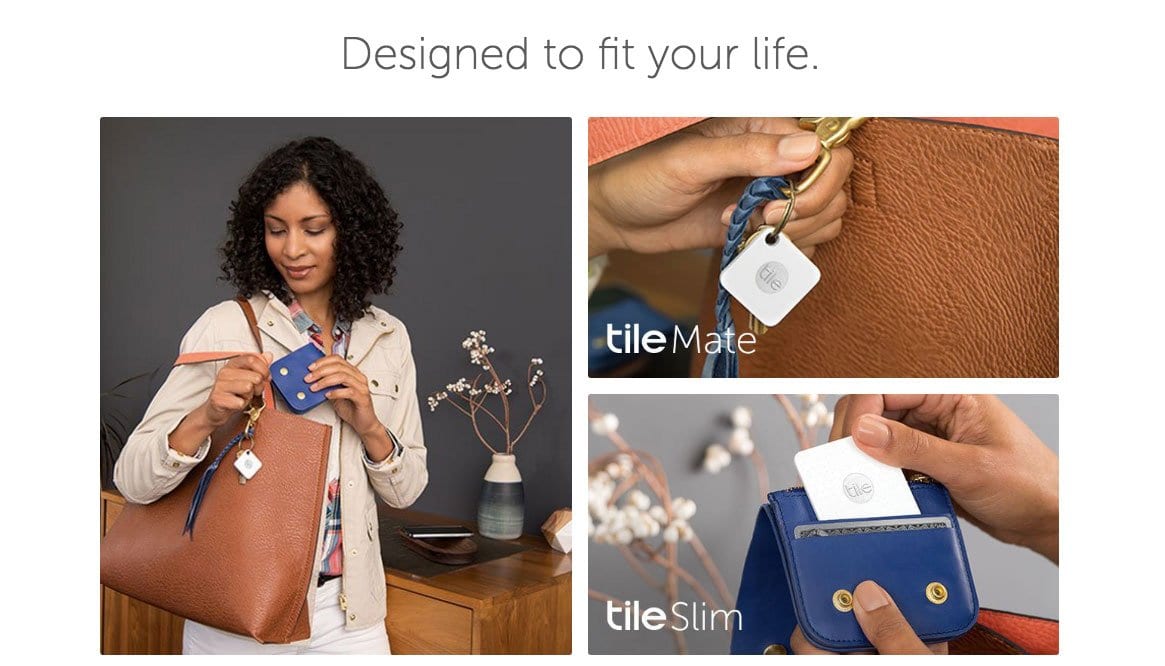
When new customers first discover your product, they might prefer to see images of other people using the product. This is particularly important for products – like the Tile – where the product itself isn’t enough to illustrate what it does, let alone its benefits. So the company uses product photography to illustrate how and why you would use it:
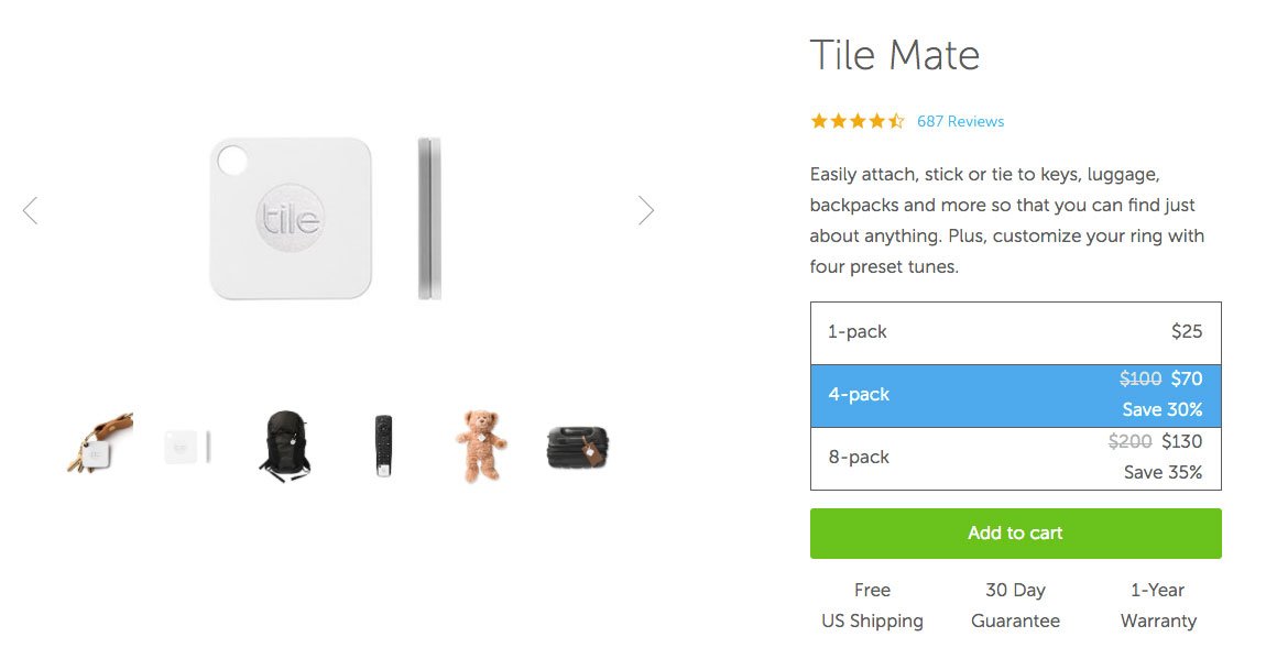
But when you dig down into the actual product page, you find more detailed photos that focus on the product itself. Once users are on the product page, they have discovered how your product solves their problem and are more interested in learning how well it does so.
Edit Your Photos
Once you have your photos, there a few things you need to do to get them retail-ready. The most obvious task is to remove their backgrounds. Having a white screen makes doing this with the Adobe Creative Cloud Magic Wand or Pen tool-less time-consuming.
Following that, you might want to adjust the contrast or lighting settings to improve the quality of your image or compensate for any changes in natural lighting. Be sure to keep your image conditions consistent though; adding any kind of filter is not recommended.
If you don’t have access to photo editing software, you can use online tools like Pixlr which has all of the tools you need to do basic photo editing. Services like Pixc can also handle your image editing needs for you by taking in your unedited images and returning back professionally edited product photos.
Optimize Your Images
The final step is to make sure your photos are optimized for both speed and SEO.
Make sure your image sizes are reasonable. Shopify recommends keeping your product images under 70kb. This can be achieved by knowing which type of file format to save your images in. As a rule of thumb:
- GIFS are low-quality images that are good for icons and thumbnails. They also support animation but are not suitable for large images due to file size and poor quality.
- SVG is a vector format, which means it uses XML to describe the content of the image in text format. It will load icons and basic images almost instantly and at a very small file size, but regular images will be too complex to use with this format.
- PNG images are faster files that support less compression which means they will retain the original image quality. They also support grayscale and transparency, but the file size is generally too big for ecommerce purposes.
- JPG refers to a method of compression that enables you to alter the degree of compression. Typically JPG images can reduce the file size by up to 10x without perceptible losses in quality. This makes them ideal for creating high-quality, low file-size product images.
Also, make sure that you are naming your images with appropriate filenames and using titles and alt tags that describe the image and content accurately. Alt tags can be used to include notable keywords, but their main purpose is to aid in accessibility.
Part 4: Keep Your Product Photography Consistent
Great ecommerce stores use product photos that work equally well on an individual product page or in a collection of similar products. Having consistent images makes searching and comparing products easier and can also create consistency and professionalism around your brand.
Here are the best ways to keep your product photography consistent:
Photograph Your Products on a White Background
One of the easiest ways to consistently produce great product photos is to utilize a white background. In our previous photography post, we outlined how you can create your own photography setup and take professional grade product photos.
Having your photos on a white background allows you to:
- Create consistency across all of your products
- Enhance certain aspects of your product
- Easily edit your photos in the future, and
- Sell your products on marketplaces like Google Shopping and Amazon that require a white background.
Use the Same Dimensions or Aspect Ratio
Nothing sticks out more on a collection page than images of different sizes. Unless you have specifically set the minimum height and width using CSS, your collection pages are going to be a jumbled up mess. Users will have to spend their precious shopping time deciphering where to click.
Consider even a simple product collection page. How much easier is it to browse and compare the square products on the right compared to the multi-sized products on the left?
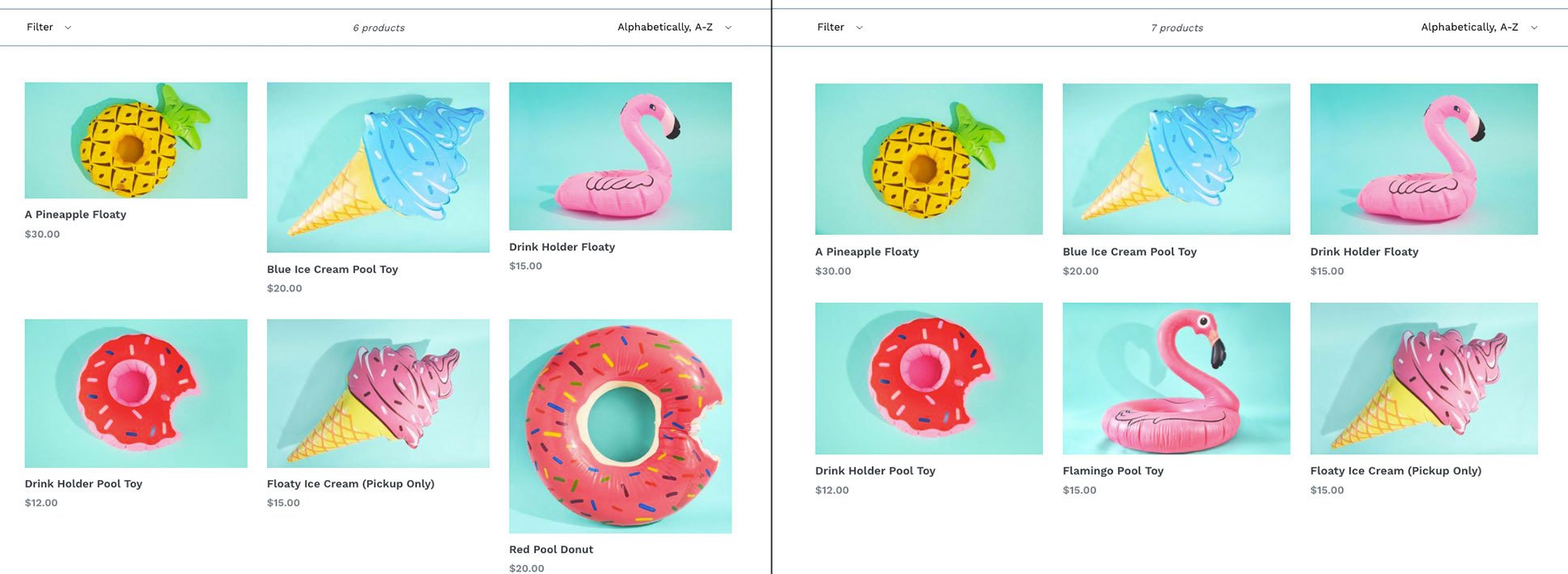
Which looks better?
While there are apps and plugins available that will square-up your images for you, the best approach is to ensure that your product images are always saved with specific dimensions.
Creating your images with dimensions between 1000px and 1600px on the longest side is ok, but you should also try to keep all of your images square. Square images will look good whether the image is horizontal or vertical and will keep your images consistent through your store.
Utilize Product Templates
To achieve a professional-looking ecommerce store, you need to create consistency across your product images. This means having photos that not only are the same in dimension but also have a similar style and consistent positioning within the image.
If you look at any successful ecommerce store, you’ll see that their images stand out on their own but also fit well within a collection as they are all positioned the same distance away from the camera.
Ensuring that your products are consistently positioned in all of your photos can be tricky. This is where product templates can help.
Product templates ensure that your products are consistently positioned in the same area of the photo and are scaled correctly. They can be particularly important if you are including any text on your product images.
To create a basic product template file using Photoshop:
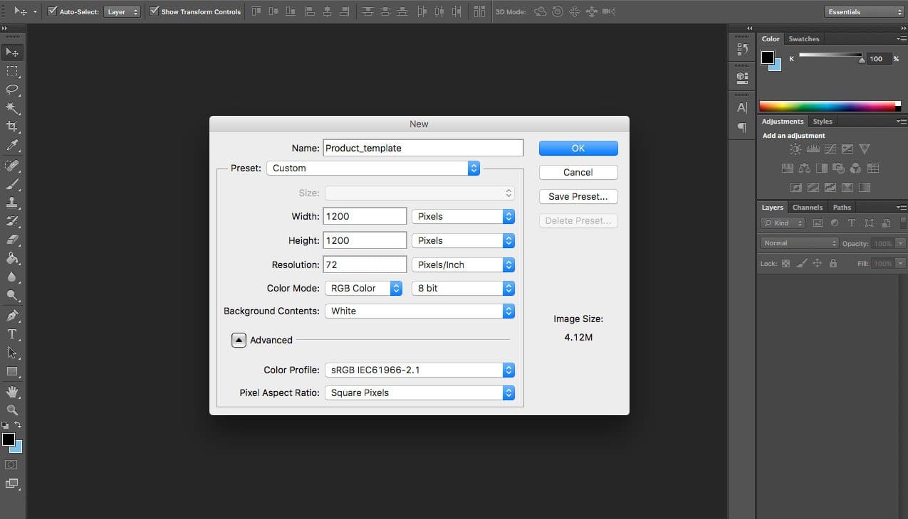
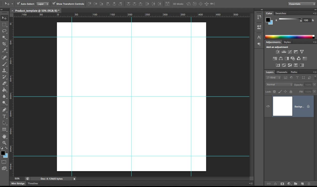
- Create a new photoshop file with your desired width and height. Make sure your color mode is set to RGB Color – 8-bit, resolution is at least 72 pixels/inch and background contents are white or transparent.
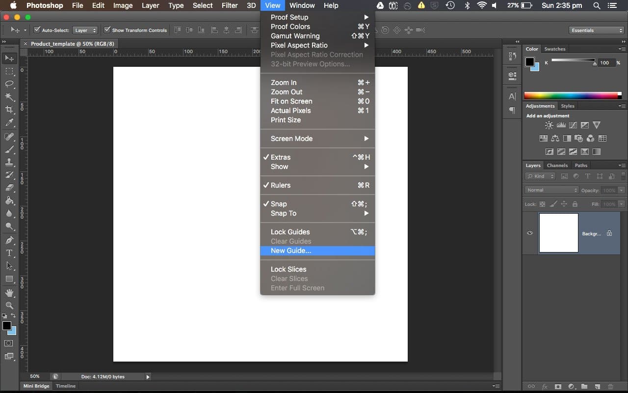
- Next, under “View” in the main menu select “New Guide”.
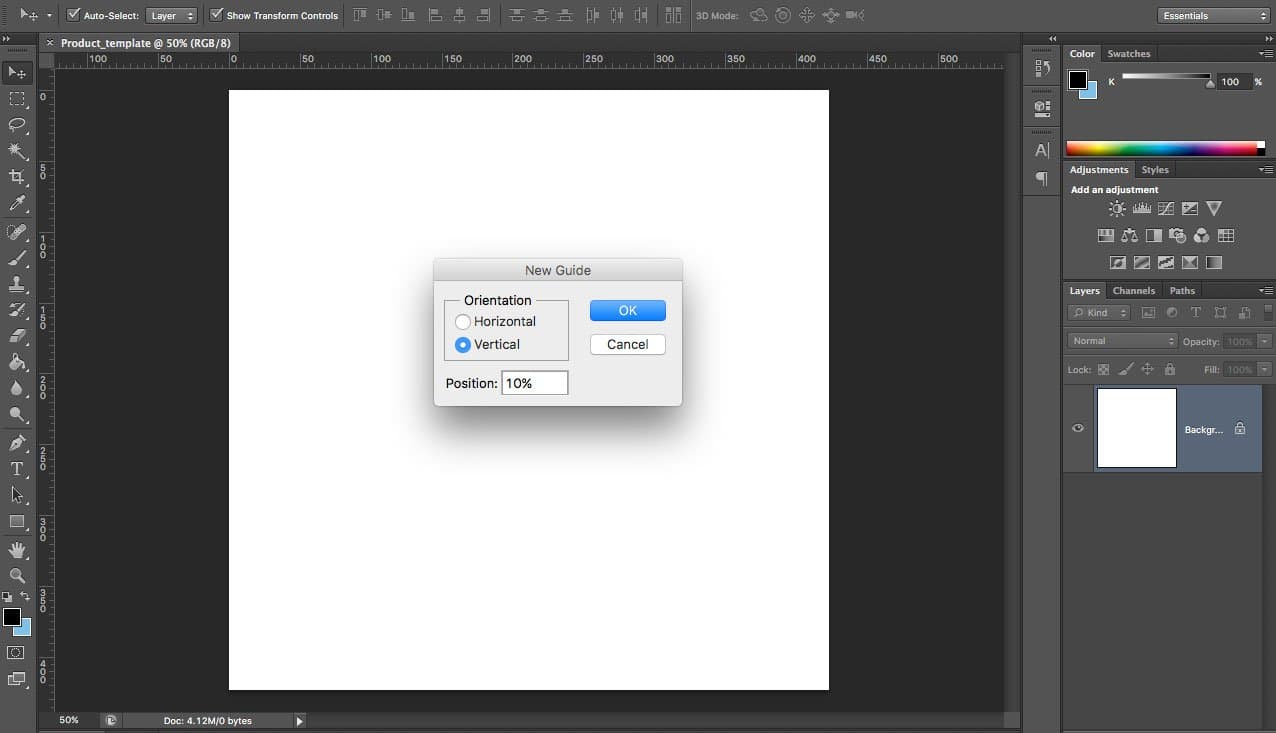
- Create a 10% vertical guide and repeat the steps so you have a:
- 10% vertical and horizontal guide
- 90% vertical and horizontal guide
- 50% vertical and horizontal guide
- You should end up with this:
- Now you can place your image over the template. The guides will give you a reference to know that your image is centered both horizontally and vertically. It will also help you ensure your products are all placed at a consistent scale.
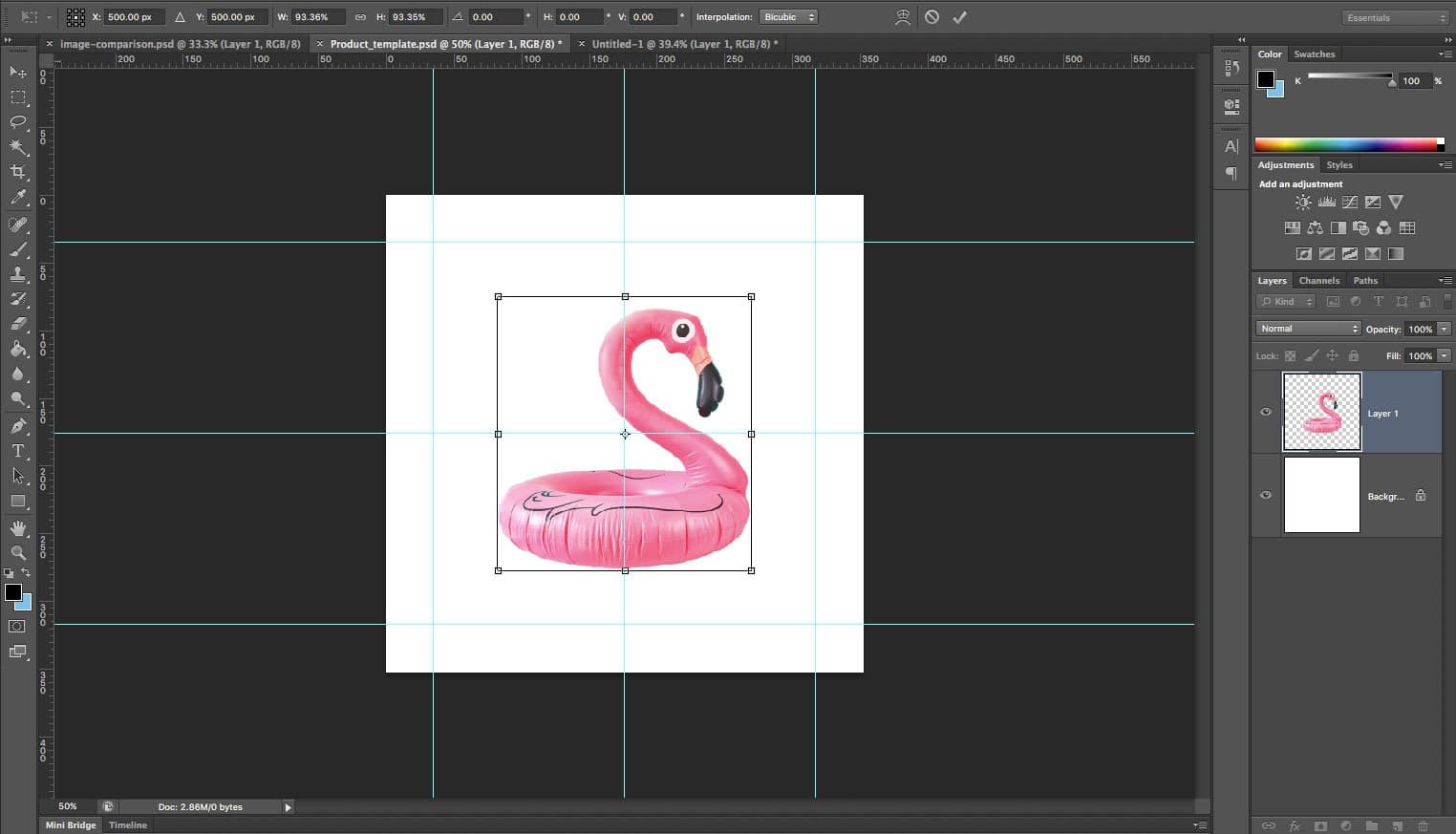
Now just save your file as a regular Photoshop document (.PSD) and your guides will be there waiting for you. The guide you have made will allow you to quickly upload any edited product photos and ensure they look consistently great throughout your website.
Part 5: Take Your Product Photos to the Next Level!
If you have great product photography and excellent product descriptions, you have the makings for a high-converting product page. But, there are still a few final things you can do to improve your product photos to make sure you have the best page possible.
Speed Up Your Images
Images can have a huge impact on page load times. If your product pages are slow to load, your visitors are going to get frustrated waiting for them to load and visit fewer of them. In fact, 40% of visitors will abandon your website if it takes more than 3 seconds to load. So product pages should be quick to load and easy to browse. Here are a number of ways you can optimize your images to achieve this.
For one, use CSS for your page background instead of an image. Similarly, CSS should be used to create borders around images and button elements.
External libraries that load plugins or image galleries can also slow down the overall load time for your page and should be avoided for the critical elements of your page.
You can also run your page through Google PageSpeed Insights to identify ways to speed up both your mobile and desktop site. Google PageSpeed will tell you which images can be compressed, how to optimize your images and how much space you can save by doing so.
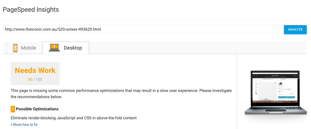
Your browser’s inbuilt developer tools can also identify how your page loads files and which files are taking to long.
To do this in Google Chrome:
- Right click on the page you want to analyze
- Select “Network”
- Refresh the page
You can sort by file “Type” to see which images are taking the longest to load, by “Size” to see the biggest files, by “Time” to see how long or by “Status” to see if any files could not be loaded.
Also, make sure your images are optimized for speed and SEO using the tips in Part 3.
Optimize Your Page for Mobile
It’s crucial to spend some time looking at how your product pages are displayed on various mobile devices. Tools like Hotjar allow you to create heatmaps of how users are interacting with your pages. And, if you have Google Analytics installed, you can compare your mobile and desktop conversion rates to determine if your mobile shopping experience is up to snuff.
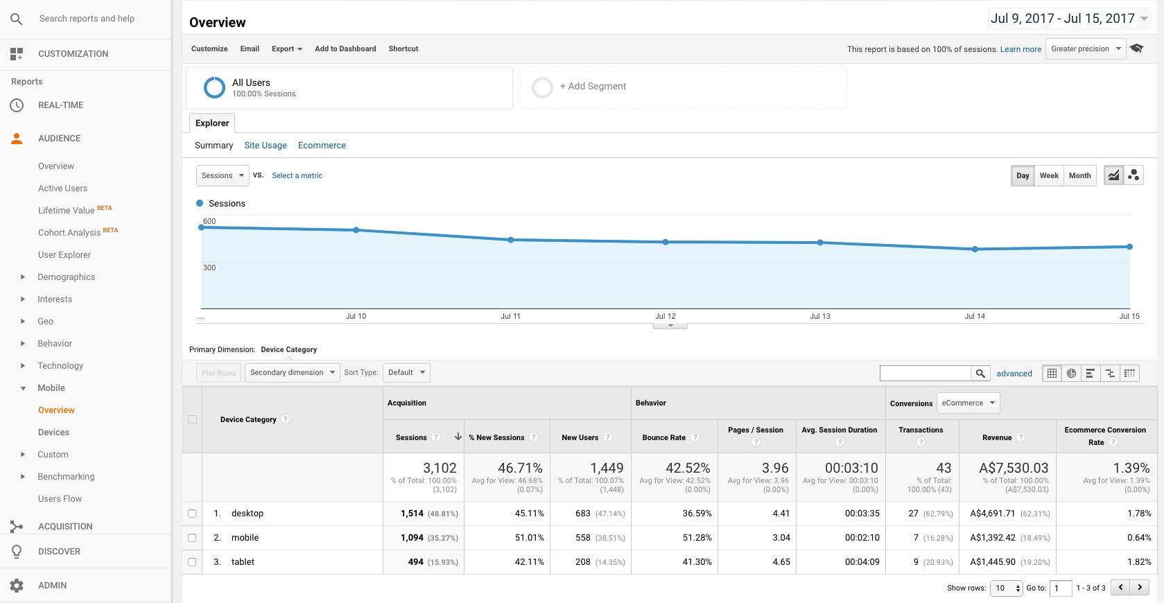
Google Analytics can provide you with a trove of useful ecommerce data on conversion rates and purchase journeys, but the simplest way to experience how your website looks on multiple devices is to experience it yourself. Using the Chrome Device Toolbar – or Responsive Design Mode if you’re using Firefox or Safari – you can see how your product page looks on any device.
Some considerations for your mobile product pages:
- Make your images front and center. Extra information should be available to users when they want it, but it should not get in the way of images.
- Speed up your site by ensuring that your images have been reduced in size and you aren’t loading too many third party plugins. Loading times are especially important for customers loading over a mobile network.
- Consider using a fixed menu bar so the customer always has access to the search bar, main menu, and cart.
Customers will spend less time browsing and reading content on mobile devices, so images will play a particularly important part for your mobile shoppers. Make sure that your images are prominent and quick to load to ensure you’re providing the best mobile shopping experience.
Remember SEO
Product pages often seem to be an under-utilized resource in terms of SEO. Your product pages give you a chance to feature some of your most valuable and unique content that can help your store rank higher in search listings. More often than not, the product page is exactly what your customer wants to see.
To beef up your product page SEO:
- Craft a unique product description that clearly outlines what your product is and matches the terms that your customers search for.
- Optimize your image metadata by including ALT tags to describe the image, appropriate title tags, and relevant file names.
- Consider adding videos to your product page. Whether or not adding videos to your page helps with SEO is up for debate, but they can help give greater context to your products which can improve your conversions.
Optimize Images for Zoom
Have you noticed how most ecommerce sites will allow you to hover over the image to “zoom” in on the product? This has become a feature that is almost second nature. We expect to get a larger version of the product when we click or hover over it.
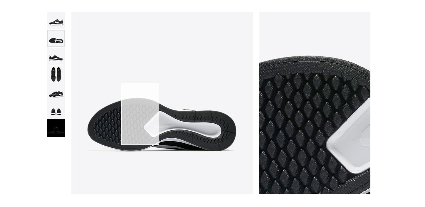
Having this feature serves an important purpose. It lets customers ascertain the quality of the product in detail. It also helps to instill confidence in the customer’s purchase when they can’t physically feel or see the product. Sometimes the quality of stitching or shade of color can make the difference between the customer choosing your product over a competitor’s.
So how do you make sure you have a functioning zoom function? The secret is knowing how to use the correct image sizes.
Most ecommerce websites will have various “templates”. These templates will resize your image to match that template size. For example, you might have:
- A thumbnail template that is 50px x 50px
- A collection image template that is 100px x 100px
- A related image template that is 150px x 150px
- A main photo template that is 500px x 500px
The zoom function typically works by displaying the image at its full, original size. So if you have an image that you’ve saved at 1000px x 1000px, when you hover over the main photo template (which is 500px x 500px), it will be displayed at twice that size.
What this means, is that to have a working zoom function, you have to make sure that your image dimensions are larger than your main photo template.
If they are the same size, the user will be looking at the same image when they hover. But if they are too big, the image size can have a negative impact on loading times and be too large to be practical.
Image dimensions between 1000px and 1,600px are typically a good compromise between file size and having an image that can provide enough close-up detail.
Conclusion
In these five chapters, we’ve been able to broadly cover the most important areas that you need to give due consideration to when crafting your product pages. If you follow these guidelines, you’ll have a product page that provides a great shopping experience for your customers and enjoys high conversion rates. Now that you have a guide, it’s up to you to go out and create a winning product page that creates sales for your ecommerce store.

