Conversion Rate Optimization: 10 Ways to Increase Sales
When a person visits your online store you want them to take an action. As a store owner, you likely want customers to purchase products from your store, however, you might also want them to create an account, add an item to their cart, sign up for your email list, or follow you on social media. Conversion is about getting customers to take an action that moves them deeper into your sales funnel and ecommerce conversion rate optimization is about figuring out why more of your store’s visitors aren’t converting and then taking steps to improve your chances of turning a browser into a buyer.
Most online stores have a conversion rate of about 1.8%, however, the top 10% can have much better results — around 3-5 times higher than the industry standard. With conversion rate optimization, you take the steps to increase your store’s chance of converting more. Even if you increase your conversion rate by 1% your business will be more profitable, thus allowing you to grow more quickly. Taking the steps to convert your customers can bring in more money both in the short term and long term. If you develop a strong relationship with your customers, you can build a loyal fanbase who will continue shopping on your website and you’ll also have access to a wider customer base that you can re-market to.
How to Determine Areas that Can Benefit from Conversion Rate Optimization
When it comes to conversion rate optimization, avoid making any assumptions and let the data tell you whether or not something converts. When you make assumptions without testing, you may be hurting your odds of conversion. Sometimes the data surprises you which allows you to better understand your customers and audience.
If you’re just starting out you can use a tool like UserTesting. You submit your website on the platform and someone will review your website. They’ll share the overall impression of your website while exploring it. You can also upgrade to a paid version where you’ll receive a more in-depth review. Having an objective third-party reviewer share insights about your website will allow you to understand what someone’s first impression of your store may be and you’ll get a better understanding of customer’s perspectives for what’s working or not working for you.
If your store regularly gets visitors, you can use the Shopify app Lucky Orange to view heatmaps and watch recordings of customers using your website. It allows you to see which areas of your site customers look at, where they click, and how they go navigate around. You might find that they click on a homepage banner that doesn’t link to the product page, or you might find that customers read reviews before making a purchase. Ultimately, you’ll have a better understanding of how your customers navigate your online store allowing you to make adjustments as needed.
You can also use Google Analytics to better optimize your online store for conversions. When looking at reports, you can see which pages could benefit from conversion rate optimization so you know where to focus your efforts on. You’ll need to know how to interpret the data in the reports so this is a bit more advanced for new entrepreneurs. You’ll want to analyze segments such as mobile devices used, buyers vs. non-buyers, new vs. returning users, and so forth. If you’re just starting out, you might want to check out Shopify’s article, Google Analytics for Ecommerce: A Beginner’s Guide.
10 Ways to Improve Your Conversion Rate Optimization
Conversion Rate Optimization Tip #1: Split Test Your Images

Product images play a vital role in selling a product. Since your customers can’t touch or try your product on in person, your images need to be compelling enough to still convince them to buy from your store.
To boost your conversions, you’ll want to test various product photos. In addition to having the product on a white background, you might want to have a lifestyle product image. For example, Casetify places their phone cases next to plants and other accessories to bring the image to life.
You’ll want to split test your images to see which converts better. Does your product convert better with a plain white background or if it’s included in a lifestyle type of image? Does your clothing convert better when worn by a person or when laid out on a white background? What number of pictures does a customer need to see on your store before making a purchase? You’ll need to experiment with your product imagery to know what converts best on your store. What works well on another store might not work for you.
If you dropship products from AliExpress you’re often provided with multiple product images. Even in this instance if you don’t take your own pictures you can still split test which image converts best. You can test different main images to determine which product image lands the sale best. When dropshipping from AliExpress, you also want to ensure that you import products that have impulse buy images. An impulse buy image is one that captivates a customer to make a quick purchase of a product they weren’t looking to buy. These types of images often work well at converting the browser into a buyer.
When creating an image, you want to ensure that the image pops against your store’s background. Having an image with vibrant colors is more attention-grabbing than a white product on a white background. Vibrant images often convert better.
Conversion Rate Optimization Tip #2: Split Test Your Ads
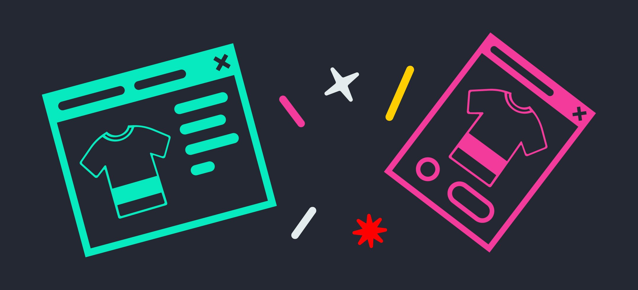
To boost your online store’s conversion rate you’ll also need to split test your ads. Firstly, split testing allows you to buy traffic more affordably and secondly, it allows enough variety so that your customers don’t get used to seeing the same ad.
Ideally, you should have several different ads running simultaneously. You’ll quickly find some products convert better than others and you’ll also find that different images, copy, and offers convert better than others too. By doing extensive testing to determine which images, products, copy, and offers work best, you work towards optimized ads, thus allowing you to draw in more customers to your store to land more sales.
However, once you’ve determined which ads convert best you’ll still need to create new ads to continue the process to prevent ad fatigue. Ad fatigue is when the performance of an ad drops because it’s been shown to the same audience too many times. You can easily prevent ad fatigue by creating ads with different products, offers, and images.
Conversion Rate Optimization Tip #3: Improve Your Site Time

Site speed plays an important role in conversion rate optimization. Some store owners noticed a 1% increase in revenue for every 100 milliseconds of site speed improvement. Others noticed a 7% decrease in conversions for every one-second delay in page speed.
There are a number of things you can do to improve your site speed: First, you can reduce the number of items the page has to download. For example, if you have several pop-ups, Shopify apps, images and more which load up as soon as someone visits your website, you may want to try removing some features so the page can load faster.
You might also want to decrease the image size of each image without impacting the quality using apps like ImageOptim or ShortPixel. Compressing your images allows your website to download images more quickly.
You might also want to use fewer scripts or embed YouTube videos instead of hosting them on your website. You’ll want to ensure that you have a great server — if you’re on Shopify you already have one.
Conversion Rate Optimization Tip #4: Use Urgency & Scarcity

Scarcity and urgency tactics work really well psychologically to convince the casual browser that now’s the time to buy. According to Sumo, an online retailer was able to boost their sales by 226% by having a countdown timer on their website.
While we were testing different urgency and scarcity Shopify apps on one of our stores we noticed a drastic drop in sales after removing the Hurrify app. The app is essentially a countdown timer you can customize and then you can create scarcity in the copy by mentioning that you have limited quantities available. This app helped boost our conversion rate to about 4%.
Scarcity and urgency work because many people have a fear of missing out. They don’t want to miss out on the deal or product with limited quantities which encourages an impulse buy. There are certain keywords and phrases you can use that’ll help encourage that impulse buy such as mentioning “Limited Edition,” “Limited Quantities,” “While Supplies Last,” “Only 2 Left,” “Sale Ends in 15 Minutes,” and they can help boost your sales. You’ll want to test it out on your store to find the phrase that encourages the most sales. Tools like FOMO and ProveSource can help you utilize scarcity, urgency, and social proof conversion rate optimization tactics on your website too, so check out our ProveSource Review to learn more.
Conversion Rate Optimization Tip #5: Update Your Website Design
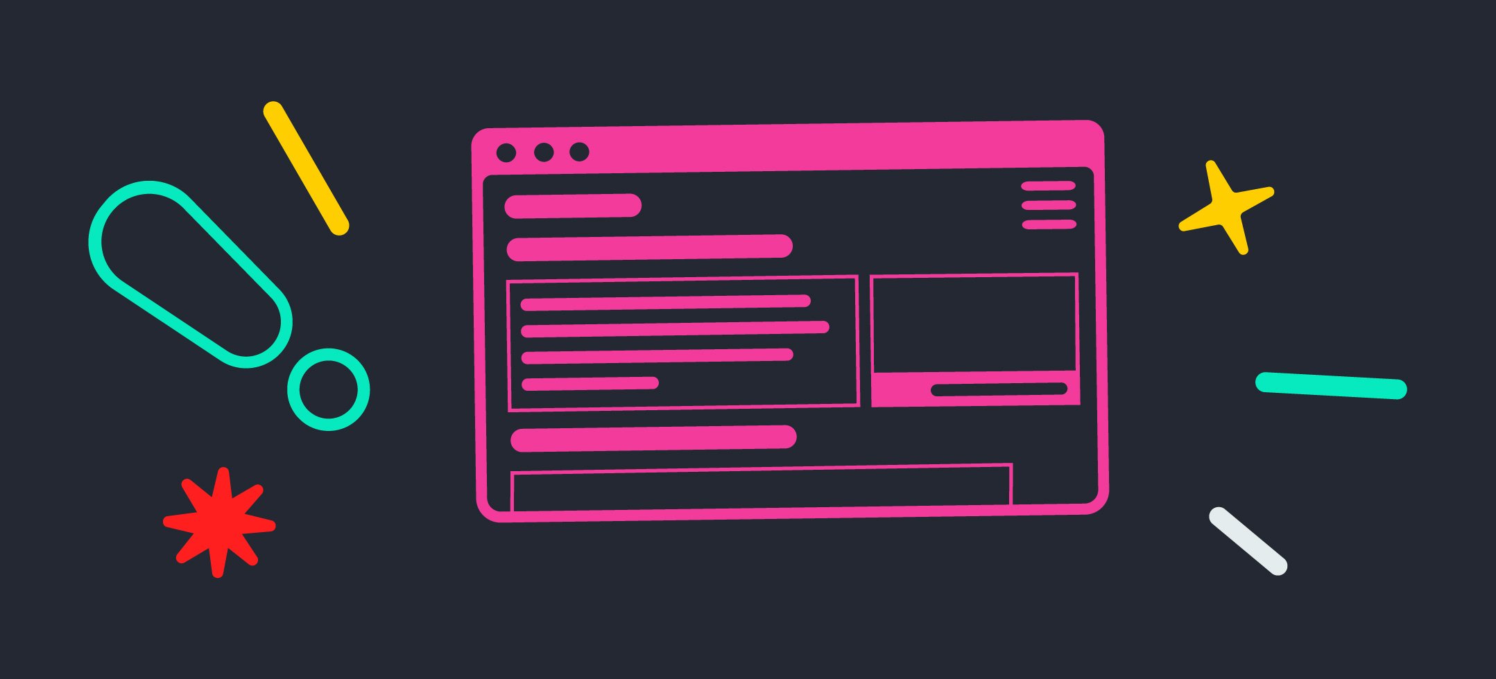
Changing your website’s look can help boost conversions. According to VWO, there are several design principles that can help boost conversions such as different colors, use of white space and more.
For example, if you look at SpaceX’s online store you’ll notice that it has a dark color scheme. They could likely further boost sales by adding a white background to product images, remove drop-down menus when there’s only one option, avoid having grey fonts on the grey background and changing any odd color fonts.
While it’s important to stay on-brand, you also want to ensure that your product images and copy are easy to read. Making slight adjustments to your online store or a drastic theme change can help improve conversions.
Conversion Rate Optimization Tip #6: Have Clear Copy

You should have well-written, clear, action-driven copy on your website. Your homepage should tell your customers what problem you’re solving for them. For example, if you sell fitness equipment you help solve the problem of excess body weight. When writing copy on your website you want to let your customers know the problem you solve to compel them to buy.
When it comes to the product page you should split test your copy. You need to figure out which format converts best whether it’s a list of bullet points, a short paragraph, a mix of bullet points and paragraph, one long paragraph or no copy. You’ll also want to showcase the benefits of your product rather than just the features. What’s the benefit of the product size or fabric? For example, if your product is made of cotton you could use copy like “for a softer feel” to optimize conversions.
You should provide enough copy on your website from product information to return policies to ensure that the customer has all the information they need to feel comfortable enough to buy from your store. Copywriting can play an important role in building customer trust. When a new store visitor trusts your brand, you’ll be better able to convert them into a customer.
Conversion Rate Optimization Tip #7: Present an Irresistible Offer

By presenting an irresistible offer you’ll be better able to increase conversion rate optimization. There are many ways to present an irresistible offer but the most common are pricing strategies and bundling.
When a product has a steep discount, it looks like a better deal. Pricing items at 50% off often works really well. You’ll want to ensure that your products are priced appropriately so that your business is still profitable.
When it comes to bundling, having a “Buy Two Get a Free Gift” or “Buy Three Get One Free” typically works well. The free gift should typically be an item with a very low production cost like jewelry or cufflinks. This strategy also helps boost average order value to ensure that you make a higher profit.
Pricing and bundling work really well because your customers won’t be able to find a better deal anywhere else. Having a free gift or a steep discount often helps encourage a customer to buy right now because people like freebies and saving money. If done effectively, you can increase your business’ revenue and profit. You will have to crunch some numbers to ensure that you take in all business costs into account.
Conversion Rate Optimization Tip #8: Sliders Can Convert Better Than Video

Some store owners choose to have a video featured on their homepage. While videos are known for boosting conversions, the length of the video matters. If your video is a couple of minutes long or longer, having an image slider (otherwise known as a carousel) might actually convert better than video. However, for the most part, sliders with only one main image typically convert best. When you have only one banner image that links out to a collection or a specific product, you simplify the selection process. Having multiple banner images can distract people during their shopping experience. Showcase your best product or collection on the banner image to drive more traffic to it and lead your customers through the sales funnel.
Conversion Rate Optimization Tip #9: Set-Up Retargeting Campaigns

One of the biggest struggles for store owners is cart abandonment. According to Baymard approximately 69.23% of carts get abandoned on retail stores. Most marketing experts recommend sending retargeting emails, however, they’re not as effective as running retargeting ads. You can run retargeting ads to customers who added your product to their cart but never went through the checkout experience. These type of ads can easily boost conversions and convert customers you thought you lost.
They work well because depending on where you run your retargeting ads they keep showing up. If you retarget with Google, websites that use AdSense will show your ad. If you use Facebook, your retargeting ads will appear on Facebook or Instagram. If you use push notifications, the customer will receive a notification on their desktop that they’ve left something in their cart.
Conversion Rate Optimization Tip #10: Focus on What’s Above the Fold

Whether it’s your homepage or your product page, everything above the fold should be optimized. “Above the fold” is the top part of the website that a visitor sees before scrolling. According to Neilsen, web users spend about 80% of their time on your website above the fold.
Since customers may not scroll through the rest of your product page, you’ll want to ensure that your customer has everything they need in order to make a purchase above the fold. You might want to include the product star rating, product photos, marketing tactics and, of course, the add-to-cart button. You’ll also want to have sale information, a countdown timer, or other scarcity and urgency tactics above the fold. Your add-to-cart button should be visible so that a customer who lands on that page can go through the sales process with ease.
Conclusion
When working to improve your online store’s conversion rate optimization tactics, never underestimate the power of testing. Little by little, you’ll start to see your conversion rate optimization bringing your business more money to work with. People who regularly optimize their online stores tend to make more money than those who don’t. Not only will optimizing your store make you a better marketer, but it will also help you build a stronger relationship with your customers. From creating copy that helps customers realize your product solves their problems to creating an easy-to-navigate store that makes shopping online fun, customers do notice the work you put into your store. Focus on creating and optimizing your store for your customers and you’ll build brand loyalty and ultimately, your sales.


