Conversion Quick Wins: 8 Ways To Boost Sales With (Relatively) Little Effort
Ecommerce businesses saw some pretty big wins in 2021.
First and foremost, the median conversion rate grew from 4% to 5.2%, a substantial 30% gain achieved over a single year. Secondly, ecommerce accounted for just under 20% of all retail sales worldwide. And thirdly, 2021 saw the number of digital buyers reaching a staggering 2.14 billion, indicating that almost one-third of the world’s population purchased items online over the past 12 months.
This data shows that shoppers are increasingly relying on ecommerce to do their daily shopping. But the truth is, many buyers still prefer to purchase items in-store. According to PWC, 47% of consumers chose a physical location to buy products in December 2021.
With this in mind, ecommerce businesses need to find ways to make online shopping just as convenient – if not more – as in-store browsing and purchasing. And, it turns out that some conversion optimization techniques have the potential of allowing them to do that.
The best bit? Several conversion-increasing strategies deliver quick wins with relatively little effort and monetary investment.
So, if you want to boost ecommerce sales in the upcoming period without breaking your back, the following eight tips are an excellent way to get started.
Gamification
One super-original conversion-boosting strategy that works is gamification.
Essentially, the term gamification describes the process of adding game-like elements to non-gaming experiences. It’s an effective way to encourage learning, boost extrinsic and intrinsic motivation, and make monotonous processes engaging by assigning rewards to activities.
And gamification has been used to drive sales for a pretty long time now.
For example, the Starbucks star-per-dollar system allows patrons to enjoy their favorite perks just by being loyal customers and actively engaging with the brand.
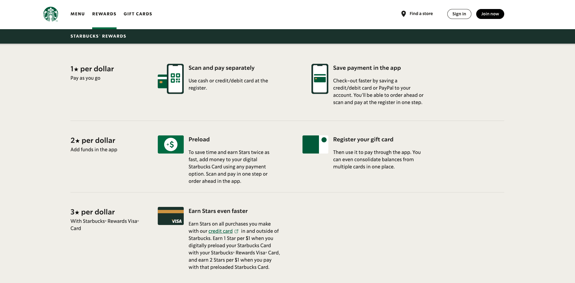
Source: starbucks.com
It’s a relatively simple system, yet, it works: In 2021, Starbucks had 24.2 million active loyalty program users in the United States alone.
Looking at the numbers, it’s evident that gamification offers benefits to those businesses that employ it properly. But, you might find yourself asking: Why exactly does gamification work?
One of the reasons gamification works so well to encourage sales is that it creates a direct link between shopping and rewards.
Purchasing items, in itself, is known to release dopamine in the brain, giving people a surge of pleasure. However, research shows that buying online makes that dopamine release even stronger. In fact, 76% of Americans say that they get more excited over online purchases because they have to wait for the items to arrive.
Now, consider the fact that excitement and anticipation additionally increase when the reward is unknown, and it becomes obvious why gamification has so much potential in boosting online sales.
How to (Easily) Apply Gamification to Ecommerce
The great thing about using gamification in your online store is that it can be relatively easy with the right add-ons.
A rewards and loyalty program, such as the one used by Sony, actively incentivizes users to spend money to earn points. Then, it offers coveted prizes. The result isn’t just an increase in conversions. But, it’s also reflected in a higher average order value (AOV) and customer lifetime value (CLV).
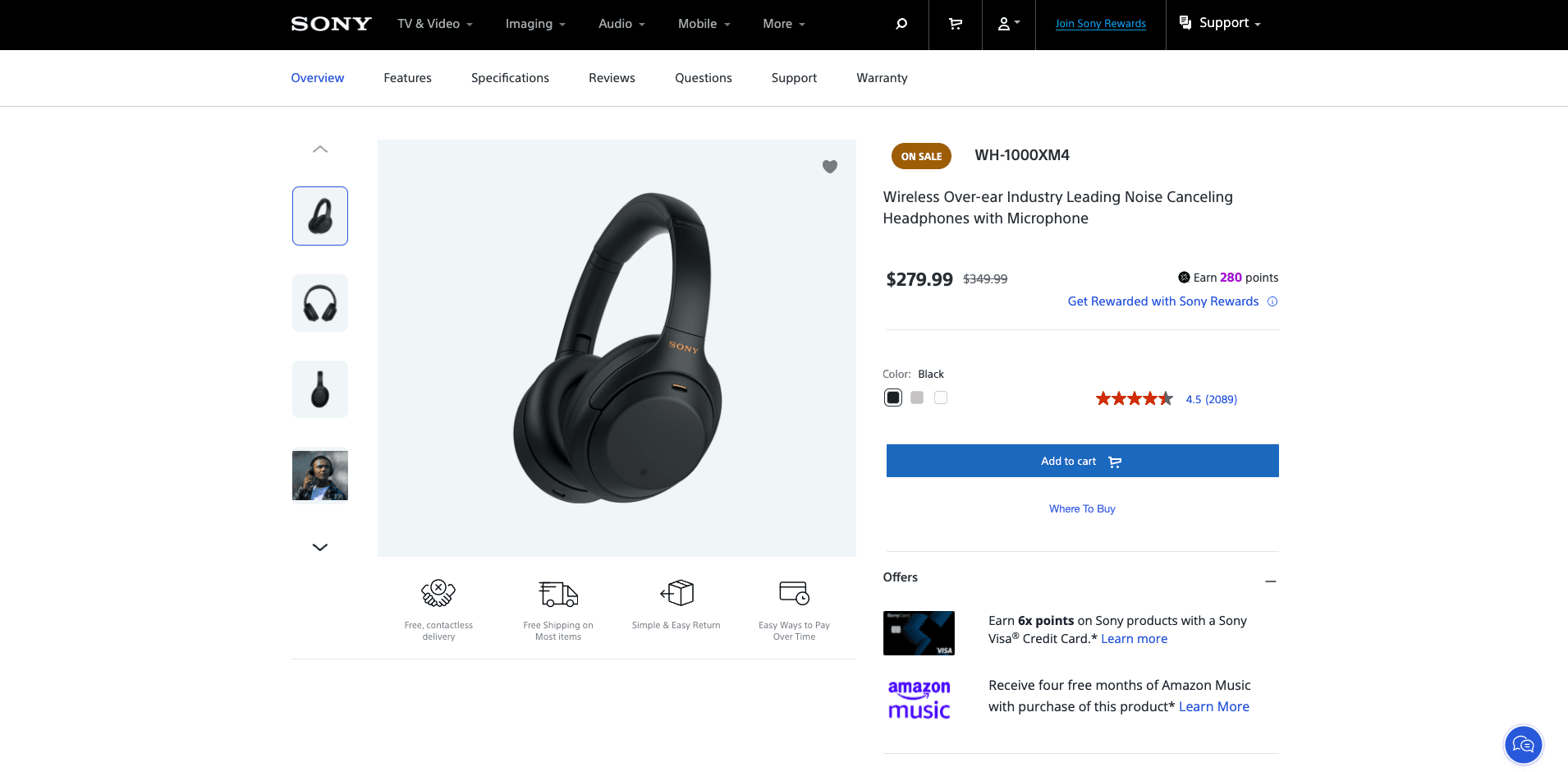
Source: sony.com
Gamified discounts are another excellent strategy to build anticipation and excitement around online shopping. They help ecommerce stores grab web visitors’ attention with the promise of a prize, then make them play a game to “earn” their reward.
Spin the wheel games are a superb example of employing gamification to boost sales. If you check out the Dress Forms USA website, you’ll see that this ecommerce brand incentivizes first-time buyers with prizes such as discounts and free shipping.
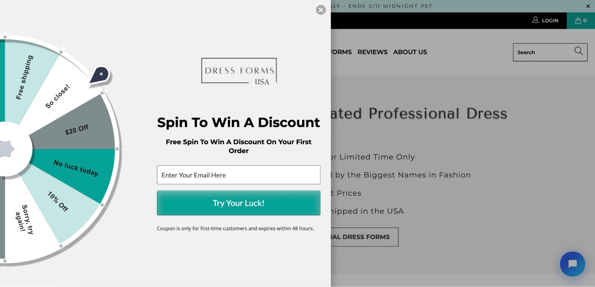
Source: dressformsusa.com
And the best thing about this brand’s approach is that it’s made possible by a Shopify add-on, which allows business owners to add interactive elements to their stores, encourage conversions, and generate leads.
Product Gallery Expansion
According to a 2017 survey, being able to touch, feel, and try products is why 67% of men and 77% of women prefer to buy in-store rather than online. And while ecommerce stores can’t compete on all accounts, they can still do their best to provide an immersive shopping experience. We’re talking about a shopping experience that appeals to consumers’ senses and gives them a good idea of what to expect from their purchase.
With that in mind, a fantastic strategy for brands looking to boost online sales is to expand their product galleries with product images, illustrations, and videos.
By employing just a few simple tactics, ecommerce businesses can match (and even exceed) in-store experiences and, consequently, boost conversions.
When it comes to expanding and improving your product gallery, you don’t have to go to great lengths to see results. Even science confirms that small changes make a big impact in positively affecting purchase intention.
Photography
For example, a research study from 2014 identified the exact attributes of product images that had sales-boosting results on ecommerce websites. According to the paper, the best way to optimize product images for conversions is to:
- Display objects in a large size.
- Minimize entropy (disorder) in product photographs.
- Use warm colors and high contrast.
- Use a higher depth of field (avoid too much bokeh).
- Show people using the advertised products.
Dowse is an excellent example of an ecommerce brand that follows (almost) all of these rules. As you can see, it doesn’t use too many photos in its product gallery. Nonetheless, each visual representation allows web visitors to gather information about the blankets Dowse sells, subtly nudging them towards making a purchasing decision without feeling like they’re taking on a risk.
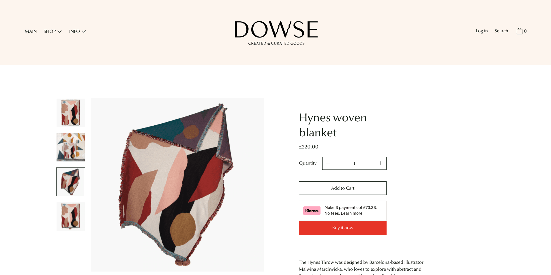
Source: dowsedesign.co.uk
Videos
In addition to adding more photos to your product pages to boost sales, you should also look for alternative ways to drive shopping intent amongst your website visitors.
It turns out videos are a terrific tool for doing just that. Especially if you consider that over 50% of consumers use online video to make purchasing decisions.
The easy way to use this information to increase conversions in your ecommerce store is to look for ways to add videos to your product pages.
Herman Miller does it beautifully, with a 10-second sequence that shows off its flagship office chair from several angles. What’s great about this video is that it manages to communicate a large amount of information without forcing web visitors to go through blocks of text to find out about the chair’s features.

Source: hermanmiller.com
Context
Another top tip for encouraging web visitors to convert is to use visuals to appeal to consumer emotions.
Lifestyle and hobby brands, like Nortvi, can use context to evoke emotional reactions from website visitors and present the items in their stores as aspirational objects.
For example, the video below uses a combination of wide and close shots, giving audiences a solid idea of what they can expect:
- breathtaking design
- premium quality
- a vague promise that owning a Nortvi product completes the first step towards becoming a stylish world traveler
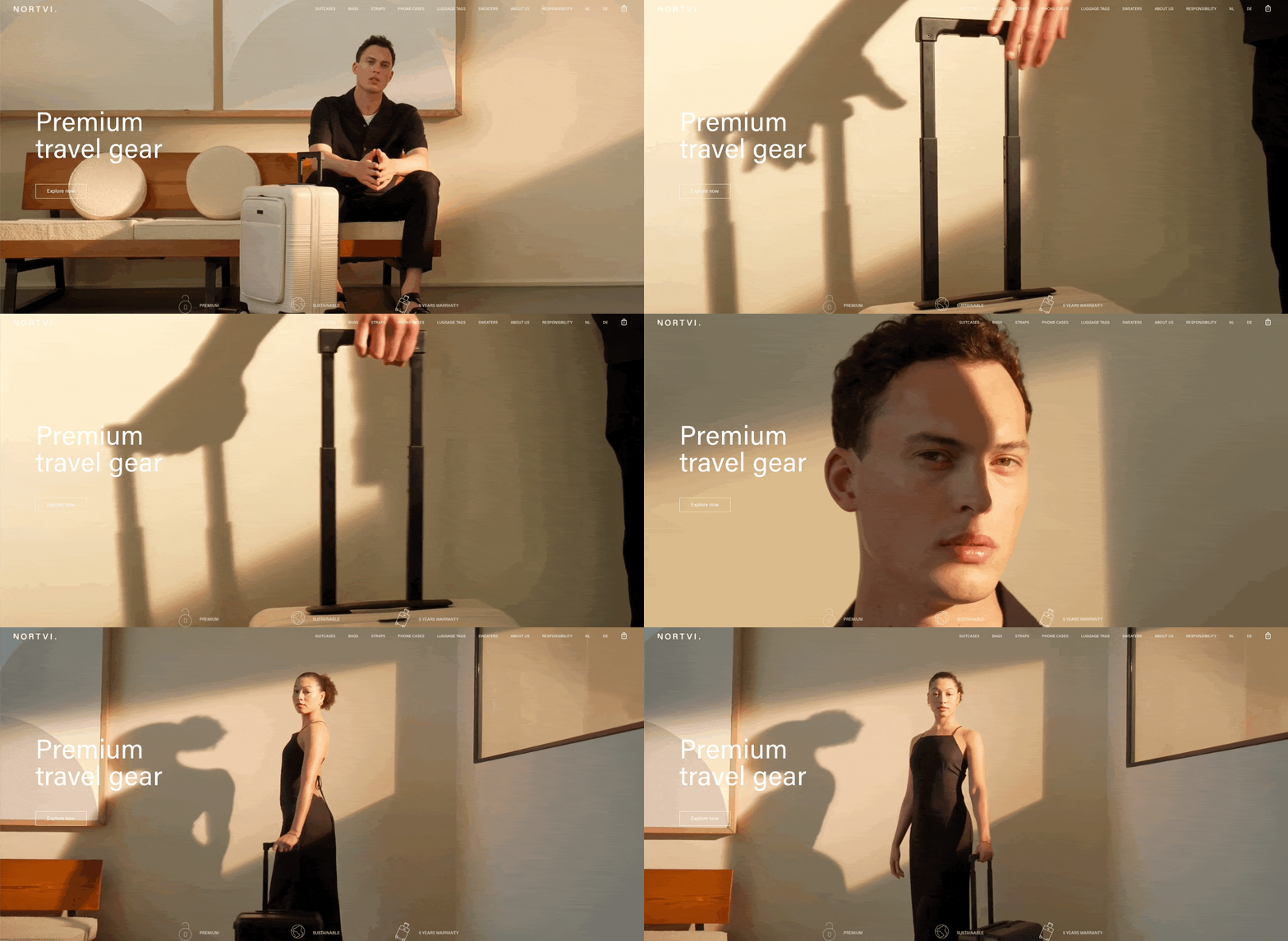
Source: nortvi.com
UGC & FOMO
The two sales-boosting strategies discussed so far offer exceptional benefits. But the truth is, they’re not exactly zero-effort ways to increase conversion rates on your ecommerce site.
So, if you’re looking for quick wins, consider utilizing user-generated content (UGC) to create a fear of missing out (FOMO) amongst your web visitors.
When used separately, both UGC and FOMO help brands drive sales.
Let’s consider how UGC impacts sales. According to TINT’s State of User-Generated Content 2022 Report:
- 72% of consumers believe that user reviews and testimonials are more trustworthy than branded content.
- 76% of people make purchasing decisions based on other shoppers’ recommendations.
- 6 in 10 marketers feel that buyers engage more with UGC than they do with branded content.
Even a quick glance at this data confirms the positive impact of implementing user-generated content in ecommerce marketing.
But what about FOMO? Does it really impact buying behavior?
Well, a study published in 2021 found that limited-quantity scarcity (LQS) and limited-time scarcity (LTS) both increased shoppers’ perceived arousal leading to impulse purchasing behavior.
How to Create FOMO by Including UGC on Ecommerce Websites
One of the great things about user-generated content is that it allows buyers an unfiltered view of how products perform in the real world. And, when that unfiltered view shows a positive customer experience, it tends to generate demand as buyers realize the benefits they stand to receive by investing in a product.
This is one of the reasons why livestream shopping and influencer marketing work so well.
And the best bit is that you can easily create FOMO by adding UGC to your product pages.
For example, check out how US Fireplace Store uses UGC on its product pages. In the reviews section, the testimonials are sorted so that those showing photos and videos appear first. This drives results for two reasons.
On the one hand, it helps turn the brand’s products into aspirational objects. On the other hand, it infects potential buyers with a healthy dose of FOMO, encouraging them to imagine those same products in their living space, then giving them an extra nudge to buy with discounts and flash sale banners.
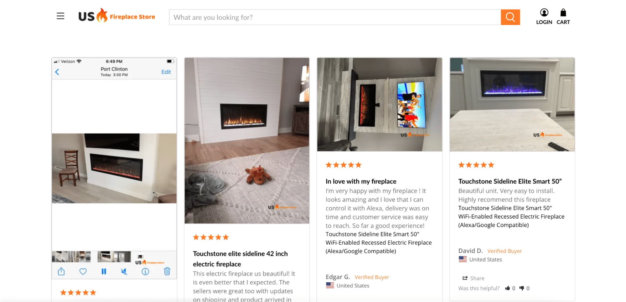
Source: usfireplacestore.com
Product Comparisons
When considering purchasing decisions, people want to be sure they’re making the right choice.
This is why 91% of consumers read product reviews in 2021, why 76% of people consider free returns when deciding what products to buy, and why mobile queries including the phrases “best” + “right now” generate more and more traffic every year.
And the best thing is, there’s a highly effective marketing strategy you can use to help consumers find the right choice for their needs (and boost your conversion rates): creating product comparisons.
This tactic works not only because it provides your customers with valuable advice on how to get the best value for their requirements. But, it also speeds up the rate at which buyers move through the sales funnel, allowing you to achieve higher conversions with fewer touchpoints.
The amazing thing about utilizing this strategy to boost sales is that it relies on the know-how you and your employees already have. The only thing you have to do is put together (well-written) content pages that give your target audience reliable advice on how to get a bigger bang for their buck.
There are a couple of ways you can do this to get the best results (with the least amount of effort).
Comparing Products Based on Price Point
A large number of buyers make shopping decisions based on their budget. In fact, 68% of online shoppers prioritize getting the best deal when considering products.
So, putting together a comparison page that presents buyers with solid options at a predetermined price point makes for an excellent way to encourage buyers to move through the sales funnel more quickly.
As you can see below, Rain or Shine Golf compares products based on four different criteria. The store is giving every single web visitor the highest chance of finding the right product that will fit into their budget – no matter how tight or generous.
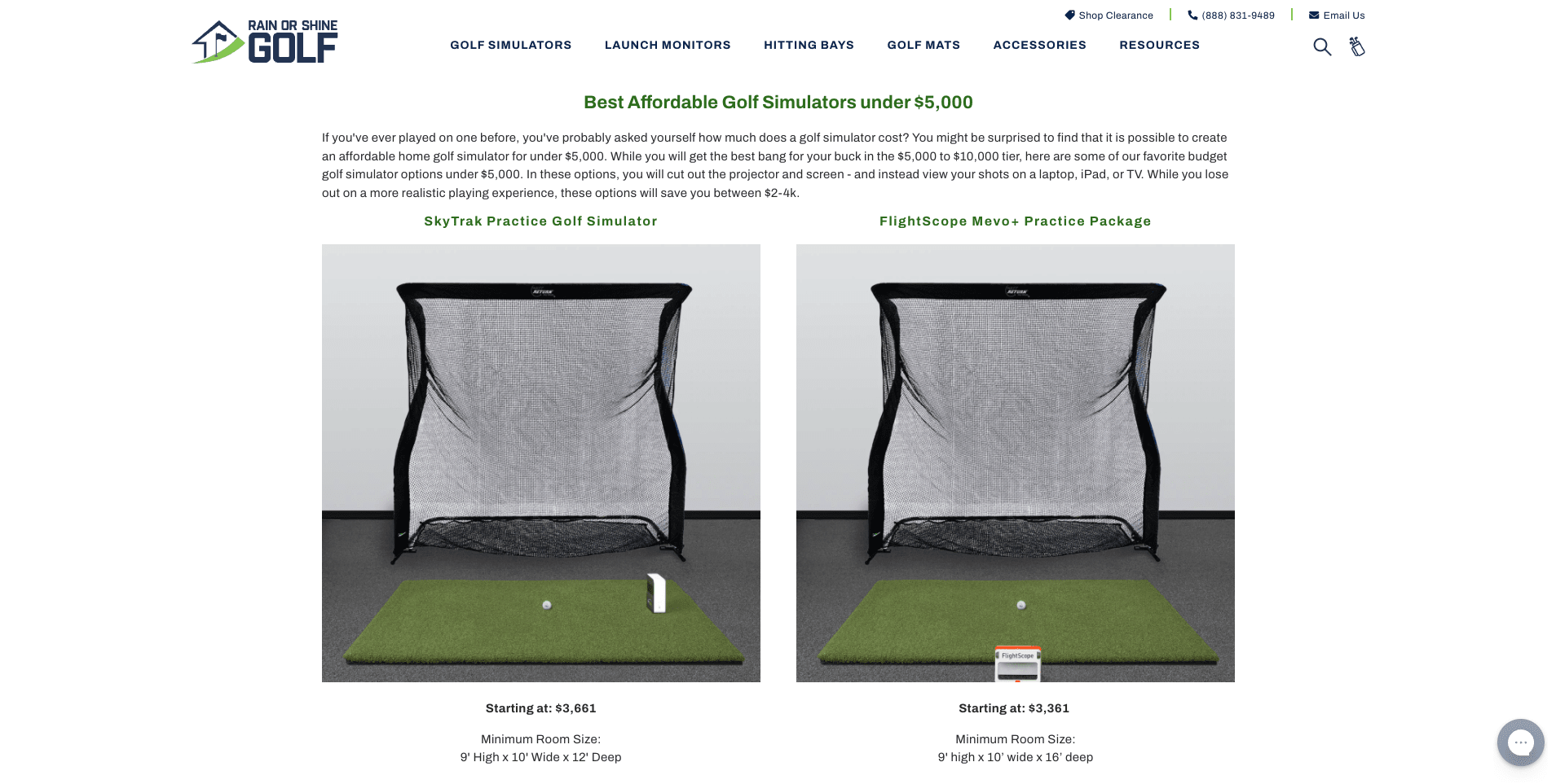
Source: rainorshinegolf.com
Comparing Products Based on User Needs
An alternative approach to comparing products based on buyer budget would be doing so based on user needs.
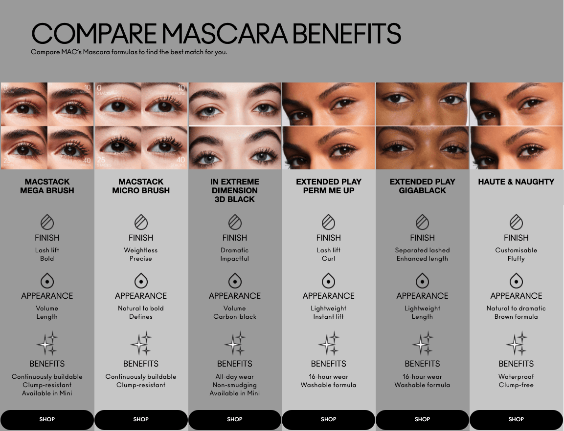
For an excellent illustration, check out the MAC website. This brand’s mascara product collection page presents a chart comparing the finish, appearance, and benefits of six different makeup products. What’s great about the execution is that each column includes a CTA button inviting users to shop the items.
Source: maccosmetics.co.uk
Price Anchoring
Another easy method to generate more sales in your ecommerce store is to use the tried-and-tested price anchoring technique.
This is a strategy that has been for a long time now. The way it works is to create price “anchors,” which influences customer psychology in two distinct ways:
- On the one hand, anchoring helps you create a reference price for the value offered by your product. According to consumer psychology research, the higher that price, the more compelled your customers will be to spend money on it. For example, a price anchor that values an item as being worth $100 will positively impact shoppers’ purchase intent if that same item is discounted to $99, even though the amount they save is a mere $1.
- On the other hand, this technique allows you to actively influence buying behavior by framing your offer in a way that causes buyers to perceive certain products as providing more value than others.
Essentially, if you’re interested in utilizing this strategy to drive conversions on your website, you can do so in one of two different ways. Both offer benefits, and you might even be capable of combining them to see the absolute best results.
Anchoring to Communicate Value Offered
The easiest way of implementing price anchoring in your ecommerce store is to assign a higher monetary value to your products then discount them.
If you check out the Orizaba Original website, you’ll see this is precisely what the brand does. It sets the value of its Baja hoodies at $44.95. But, applying a discount, Orizaba Original allows buyers to grab the items for as little as $34.99. Essentially, the store is using consumer psychology to increase purchase intent and boost the likelihood of web visitors turning into paying customers.

Source: orizabaoriginal.com
Anchoring to Influence Buyer Behavior
Alternatively, if you have a particular product you want to sell more of, you can use price anchoring in a way that allows you to present that product as offering the most value to customers.
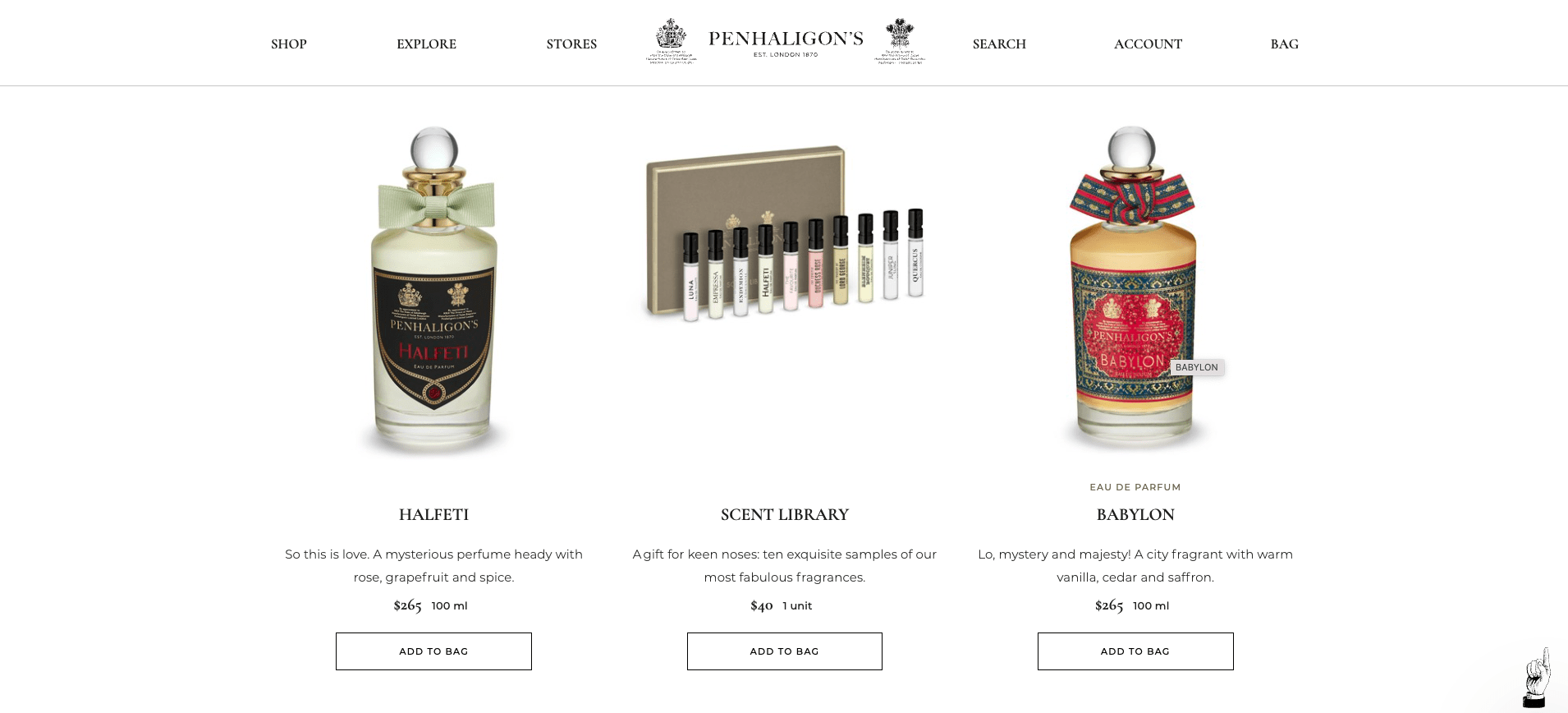
For an illustration, check out the Penhaligon’s webshop, where a tester set of ten fragrances wins a prime spot.
Note how the set is flagged on both sides by perfumes costing six times as much. This choice of layout encourages web visitors to choose the tester set instead of a single scent. That way, the brand ensures maximum conversions, offering a product for everyone’s budget. Plus, it lowers the risk of first-time buyers not finding something they like about the products, actively working towards achieving a higher customer lifetime value.
Source: penhaligons.com
Customer Concerns
The next easy method to boost sales in your ecommerce store is to look at all the factors that keep website visitors from converting.
For example, Baymard’s research on cart abandonment rates shows that, in 2022, shoppers failed to complete their purchases due to: high extra costs, slow delivery, not trusting sites with their credit card information, unsatisfactory return policies, and lack of payment methods.
These are all real conversion-hurting concerns keeping web visitors from becoming customers. So, you need to look for ways to address customer concerns to make the shopping experience feel safe and convenient.
The best part? This could very well mean highlighting customer experience policies you already have in place.
Shipping Costs/Time
Free and fast shipping is essential to making it in the ecommerce business.
According to a survey from October 2021, 59% of shoppers make purchasing decisions based on free shipping availability. Moreover, 59% of people will increase their spending to qualify for free shipping. And, 90% of them expect to receive their orders within a week.
But the best part is, knowing this gives you a guaranteed-to-work low-effort strategy for boosting sales: being transparent about shipping costs.
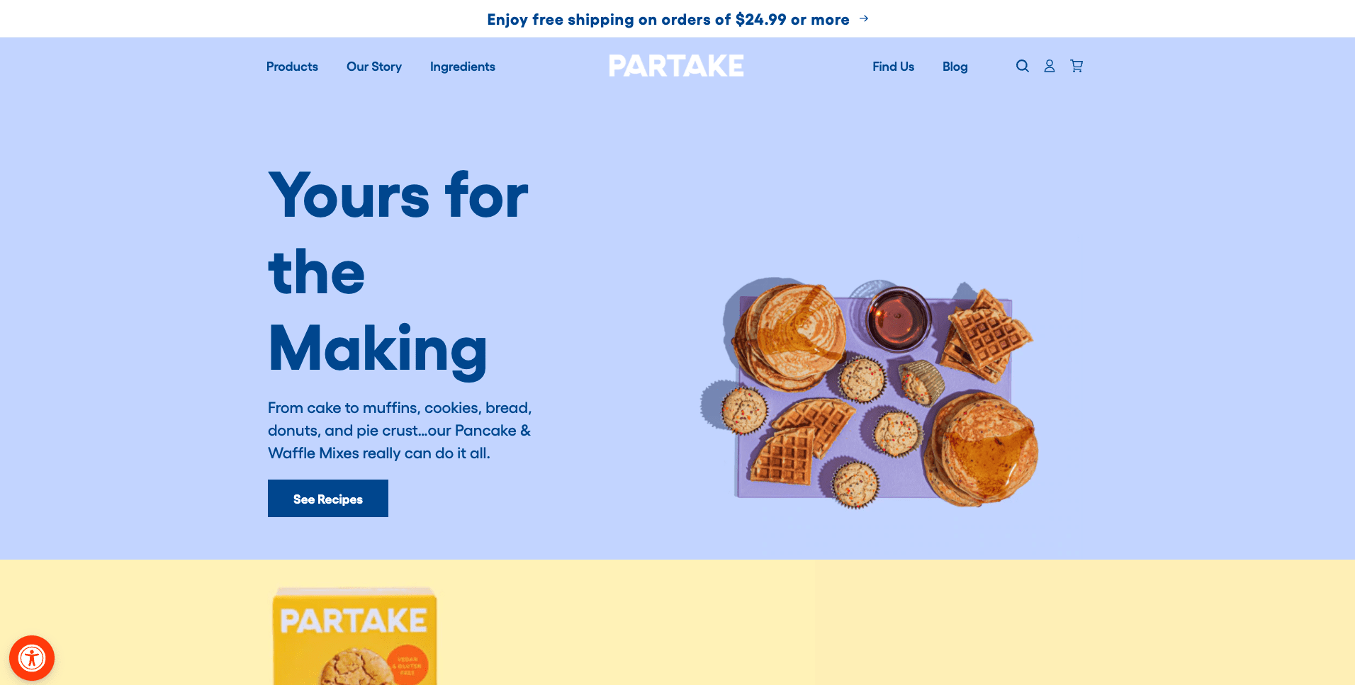
The easiest way to achieve this is to add a banner to your site, like the one used by Partake, so that web visitors know how much they have to spend to receive their ordered products. It’s also not a bad idea to indicate how much people will have to wait for their orders and to highlight any next-day shipping options you may offer.
Source: partakefoods.com
Security, Quality, & Returns Trust Badges
Another easy way to encourage web visitors to go through with their purchase on your site is to add trust badges to your homepage and product pages.
These can take the form of:
- Transactional security assurances (like pointing out that you accept safe payment options like PayPal, credit cards, and various digital wallets)
- Industry accreditations (like stating that you’re a certified B-Corp or use organic ingredients)
- Indicating that you offer free returns and a 100% satisfaction guarantee with each purchase
To see this tactic in use, check out the footer of the Tom Bihn website below.

Source: tombihn.com
The Human Element
Automated sales processes are great for cutting costs and speeding up issue resolutions. In fact, according to a Tidio survey performed in 2021, 88% of web users chatted with chatbots last year. And 7 out of 10 found the experience positive.
However, there are a few situations where “old school” human assistants still outperform AI: product returns, troubleshooting, and complaints.
Win Over Customers With the Promise of Human Interaction
If you’re looking for easy ways to boost sales without having to make too many tweaks to your website, one simple thing you can do is highlight the fact that your customers have the opportunity to get in touch with human assistants.
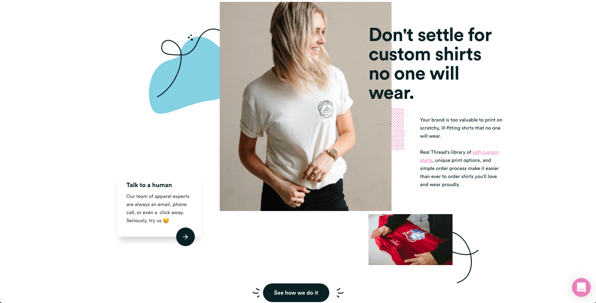
For example, the Real Thread homepage features a “talk to a human” call to action.
This piece of brilliant copywriting acknowledges people’s frustrations about automated sales processes. It reassures the brand’s audience that their needs will be met and indicates that Real Thread is 100% committed to ensuring a positive customer experience even to those who need completely unique solutions.
Source: realthread.com
The Need for Speed
Finally, as you look for conversion-boosting strategies that won’t take months to deliver results, don’t underestimate the fact that technical website performance has a high impact on the likelihood of you making a sale.
Site speed, for example, plays a tremendous part in getting website visitors to convert.
In fact, a 2020 Deloitte report uncovered that improving mobile site loading speed by 0.1 seconds led to an 8.4% increase in conversions and a 9.2% bump in average order value.
How to Easily Speed up Site Performance and Load Times
Fortunately, there are a lot of things you can do to improve your ecommerce website’s technical performance. Super-easy options include:
- Switching to a better hosting service.
- Enabling compression on CSS, HTML, and JavaScript files.
- Minifying code.
- Optimizing images.
- Reducing redirects.
- Using browser HTTP caching.
- Minimizing the number of external scripts.
If you’re not entirely sure how your site performs in terms of speed, then the first thing you’ll need to do is test it. Google’s Test My Site feature is a great place to start. It doesn’t just show you where you stand but also gives actionable tips on things you can do to boost performance.
In Closing
Boosting sales on your ecommerce website doesn’t have to be complicated. Chances are that your website already has most of the elements that you need to go from average to exceptional conversion rates.
If you’re after quick wins and a high ROI, the eight strategies described in this article are an excellent place to start when aiming to increase conversions. However, if you want to ensure the long-term success of your ecommerce business, the tactics described here are just that: a start.
To take your brand to the next level, don’t forget to also evaluate your marketing tactics. Focus on improving the customer experience you offer. And most importantly, optimize your customer retention strategy so that you have the highest chance of forming a loyal base of buyers who will come back to your store time and time again.


