How to Minimize Your Store’s Bounce Rate & Keep Visitors On Your Site
Here’s the deal: If you have a good website, great products, catchy content, and yet you still have a high bounce rate, then you have a problem.
A high bounce rate is really discouraging, and if you’re one of those store owners who’s looking at their dashboard and wondering:
- Why your customers made it to the end of your sales funnel without actually taking that final step to checkout
- Why they’re clicking the back button after viewing a page
- Or why they’re heading off to another website after browsing your store
Then you’re not alone.
Recent statistics show that the average bounce rate for ecommerce stores is as high as 45.68%! By reducing your own bounce rate, not only will you increase customer engagement, but you’ll also boost your sales and SEO too.
So, if you’re looking for actionable strategies to reduce your website’s bounce rate, then read on.
But, first things first.
What Do We Mean By Bounce Rate?
For the sake of clarity, let’s agree on what we mean by “bounce rate” first before diving in any further.
Google defines a “bounce” as “a single-page session on your site.” In other words, when a visitor clicks into your website and then leaves without doing anything else.
So, a “bounce rate” is the total number of people who figuratively walk into your store and then promptly leave without even taking a walk around.
Make sense?
Now we’ve clarified that, let’s explore a few techniques you can use to reduce your bounce rate.
Tip #1: Optimize Above-the-Fold Content
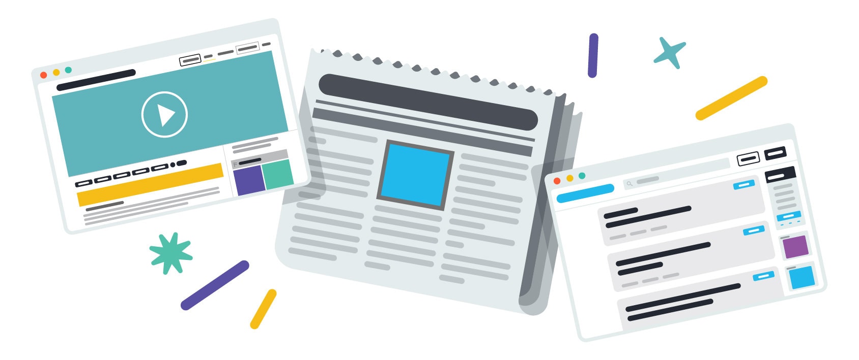
Initially, the newspaper industry coined the phrase “above the fold” to describe the content that’s visible on the top part of a folded newspaper. However, when applied to websites, “above the fold” refers to the top part of your web pages that visitors see without having to scroll down.
What shoppers first see when they land on your website is really important. It plays a massive part in determining whether they click away or continue browsing other parts of your website.
In fact, the average time a visitor spends on a homepage is just 15 seconds. That’s why it’s essential that you place your best content “above the fold,” where it’s easy for them to see.
That being said, it can be challenging for website owners to determine where the “fold” actually is because it varies depending on the devices visitors use to access your content. Different types of devices like computer screens, monitors, smartphones, tablets, etc., have varying screen sizes. However, most web designers agree that the fold line sits around 600 pixels tall and 1,000 pixels wide.
That aside, here are a few simple things you can do to optimize the above-the-fold content for your homepage, specifically:
- Have a catchy and informative headline at the top of the page
- Write an equally punchy and informative sub-header where the substance of your message lies. It’s where you tell visitors why they should hang around and will likely point out your unique selling point (USP)
- Always include a call-to-action button. This should be a clickable button that encourages customers to engage with your site in some way by asking them to “Subscribe,” “Buy Now,” “Read More,” or “Learn More”
- Use eye-catching imagery. A beautiful image speaks to your customers when words sometimes can’t
- Showcase any special discounts or offers like current sales, perks for new customers, or free shipping spends. Usually, this information is presented in the form of a banner
Tip #2: Make Your Webpages Scannable
Evidence shows that 79% of people scan a webpage rather than read it fully. So, if most people are doing this, why not cater to this habit by creating easy-to-read pages that are enjoyable to look at, too? Web pages that are optimized for “scanners” works both in your visitors’ favor as well as your own.
Here are a few things you can do to create scannable web pages:
- Keep Headlines Concise & Enticing So That They’re Short & Catchy: Don’t forget to also use keywords at the start of your headline. Not only is this great for giving scanners important information, but it’s also optimal for SEO.
- Use the “F” Shape: Typically, website visitors will scan your web page in an F-Pattern from the top left to the top right and then down from the top right to the bottom right in an F shape. Again, this is another reason why all your essential words should be at the start of your sentences and in headlines where they can be seen.
- Break Up Walls of Text: A text-heavy page is off-putting and unscannable so break your text into smaller chunks that are anchored by headings.
- Make Your Calls-to-Action Easy to Find & Identify: You need to make it as easy as possible to get visitors to do what you want them to do so make your call-to-action buttons clear. Not only does this help to reduce your bounce rate but it should also help improve your conversion rates, too.
- Use Lists in Your Copy & Blog Posts: Lists are easy to scan and recall, making them much more effective for your visitors. Plus, they’re also another way you can break up big chunks of text.
- Avoid Too Much Detail: Page scanners are looking for the quick-and-dirty version of things, so keep that in mind as you’re putting your page together. Leave the detailed explanation for a blog post or another webpage.
- White Space is Your Friend: Making white space (otherwise known as blank space, or space on the screen where there’s no text or images) is a popular tactic for preventing large text blocks from overwhelming visitors, which could prompt them to bounce from your page.
- Highlight Your Content: Make your text stand out using bold, italics, color, and highlights. It’s eye-catching, helps break up the text, and draws attention to what you want scanners to look at.
Tip #3: Use Images On Your Site
We’ve already touched on the importance of using strong imagery on your homepage above-the-fold, however, it’s equally important to use the right images throughout your website to keep visitors engaged for longer.
Images aren’t just there to make your website look pretty—they’re another means of illustrating important ideas, highlighting calls-to-action, showcasing products, and providing crucial information and/or education for your customers.
Here’s some advice for making the most out of your website’s images:
- Don’t be afraid to use high-quality photos as fullscreen backgrounds or next to your call-to-action
- If you have the budget, invest in a professional photographer who has demonstrable experience taking shots for ecommerce store owners. If you’re on a tighter budget, learn about product photography to make sure you get your images right
- Optimize your images. This helps speed up your webpage load times, which is a well-known part of keeping healthy bounce rates. A widely quoted study found that 57% of consumers leave a website after just three seconds if it’s slow to load. Not only that but if a page loads within two seconds, it only has a bounce rate of 2%, whereas if the same page takes five seconds, the bounce rate increases to 38%
- Choose images that illustrate your brand’s personality so visitors are more likely to identify and engage with them
- Insert an image after around every 100 words to keep your pages interesting
Not sure how to take your own website photos? There are tons of royalty-free image marketplaces you can source images from instead.
Tip #4: Upload Video Content
Uploading good-quality, fun, informative and engaging video content is one of the best ways to keep visitors on your pages for longer. For best results, place a video above the fold!
Video marketing has long been a popular and successful way for brands to engage with customers.
Here’s the proof:
- 87% of video marketers say they’ve seen an increase in website traffic due to video
- 81% of video marketers say video increases the time people spend on their website
- Consumers spend 2.6x more times on a webpage if it has a video on it
- If a consumer has a good experience with a site’s video content, it can increase brand awareness by 139% and increase your customer’s purchasing intent by 97%
- Adding video content can reduce your bounce rate by up to 34%
Those are pretty convincing stats, aren’t they?
Let’s explore a few things you can do to reduce your bounce rate with video content:
- Put your video nearer the top of your page and if it’s on your homepage, ideally put it above-the-fold
- Make the play button large and have it a contrasting color to help entice customers to press it
- Never put videos on auto-sound or autoplay because it’s likely to annoy your visitors
- Make your video content shareable across all platforms to help extend your reach
- Ensure that your video contains a verbal and written call-to-action
- Create and publish explainer videos (especially on your product pages!). The average consumer will watch a “how-to” video for 2 minutes longer than other kinds of video
Tip #5: Create Quizzes & Polls
Quizzes and other interactive content like polls keep people engaged with your site by harnessing the power of entertainment.
Quizzes have long been a popular way to interact with consumers—and for good reason. BuzzSumo analyzed their data and it showed that the average quiz gets shared almost 1,900 times and the most popular one was shared 4 million times. BuzzSumo also points out that even quizzes that are shared the average amount of 1,900 times is a lot more shares than most blog posts would get (which take a lot more work to create) plus, quiz content is usually even easier to create because you can use existing content (or knowledge that you already have) to create them (Source).
That’s why including quizzes on your website (if it’s appropriate for your brand, of course) can be a really effective way to reduce your bounce rate.
Here are a few other advantages to publishing interactive quiz content on your site:
- You can use them as an opportunity to grow your email list and capture customer data
- They can be a source of entertainment for your visitors
- They’re shareable, which can help boost your traffic
- They can even be informative. For example, you could have a quiz that matches your customers up with products of yours that best suit their needs
There are plenty of quiz makers available—a popular one is Typeform. Shopify users also have access to apps such as Quiz Kit and Fyrebox Quizzes, among others. Tools like these are great because they typically come with a series of templates that make it super quick and easy to create interactive quizzes.
Tip #6: Minimize Pop-Ups (Unless Absolutely Necessary)
There are advantages and disadvantages to using pop-ups on your website.
In some instances, they can work. For example, they’re effective at:
- Drawing attention to special offers that you can’t fit in above-the-fold
- Advertising upcoming sales
- Encouraging visitors to sign up to your newsletter
That being said, pop-ups can also contribute to your bounce rate.
How do we know this?
Because recent research shows that almost 70% of consumers find pop-up ads both intrusive and annoying. So, if you do use pop-ups, ensure that they’re well designed and as discreet as you can make them.
Here’s how to make pop-ups as bounce-proof as possible:
- Create exit-intent pop-ups that give bouncing visitors a one-time-only discount
- Design pop-ups that offer interactive content such as quizzes
- Include a desirable call-to-action in your pop-up
- Schedule your pop-ups so they don’t interrupt your customer’s shopping experience. For example, pop-ups that activate once a visitor has been inactive on your page for longer than 10-20 seconds
- Keep pop-ups off to the side and out of the way so they’re less obtrusive
Tip #7: Target the Right Keywords
Optimizing your site for the right keywords plays an important role in your site’s overall bounce rate. If you’re targeting keywords that are loosely related to your content or are pretty unrelated, then when searchers arrive at your site they’ll realize the content isn’t what they’re looking for and they’ll click away.
So, one of the best ways to reduce your bounce rate is to target the right keywords for the kind of content that you have on your webpages. This might mean that you have to target keywords with lower search volumes but it’ll be worth it in the end when the traffic that’s coming to you is highly relevant.
This means that you’ll likely want to focus on targeting long-tail keywords because they’re more specific rather than short-tail keywords which are usually more generic. You might also want to target high purchase-intent or high information-intent keywords so that you’re more likely to attract more “serious” visitors who are looking for something rather than just browsing.
Are You Ready to Minimize Your Store’s Bounce Rate?
We hope that our comprehensive guide to minimizing your store’s bounce rate gave you some actionable bounce-rate-reducing ideas that you can put into practice on your website.
By implementing these suggestions onto your site, you’ll better engage with your customers, and hopefully retain them, which should lead to a boost in sales. Ideally, it’ll be a win-win situation for both you and your website visitors!


